A Password Manager for Everyday People
Privacy and online security are expected to be some of the most valuable services today. We hear it so often from business reviews, but are everyday people really ready for it?
To provide such services, trust is an inevitable element. We challenged to build trust through our design.
Project Summary
OVERVIEW
Date: April 2021
Type: Client Project
Duration: 3 Weeks
Team Size: 3
Setup: Remote
Device: Desktop and Mobile
Scope: Redesign of Onboarding
Constraints: No Google Analytic Data available
ROLE
Each of our team members took a part in all steps of the design process, Double Diamond. However, my focus was on research and its synthesis to build the design framework.
Team Members:
Chelsea Mangold
Lisa Lonoce
UX SKILL
- Screen Survey
- User Interviews
- Affinity Mapping
- Usability Testing
- UX Audit
- Competitive/comparative Analysis
- User Flow
- Information Architecture
- Prototypes
CHALLENGES
- A broad design brief
- Skepticism from users toward the innovative security solution from a start-up
- No Nettoken user available for user interviews
- Ambiguous connection between target user and product
RESULT
Deliverables:
- Research
- UX Audit
- Information Architecture
- Prototype
Client was very content with our design proposal and will implement all the proposals on the next sprint.
KEY LEARNING
- UX research has a huge impact not only on usability but also business direction.
- Data-driven design foundation is so critical, especially working as a team.
- A good recruitment of user interview is the key to gain fruitful insights.
Final Prototype
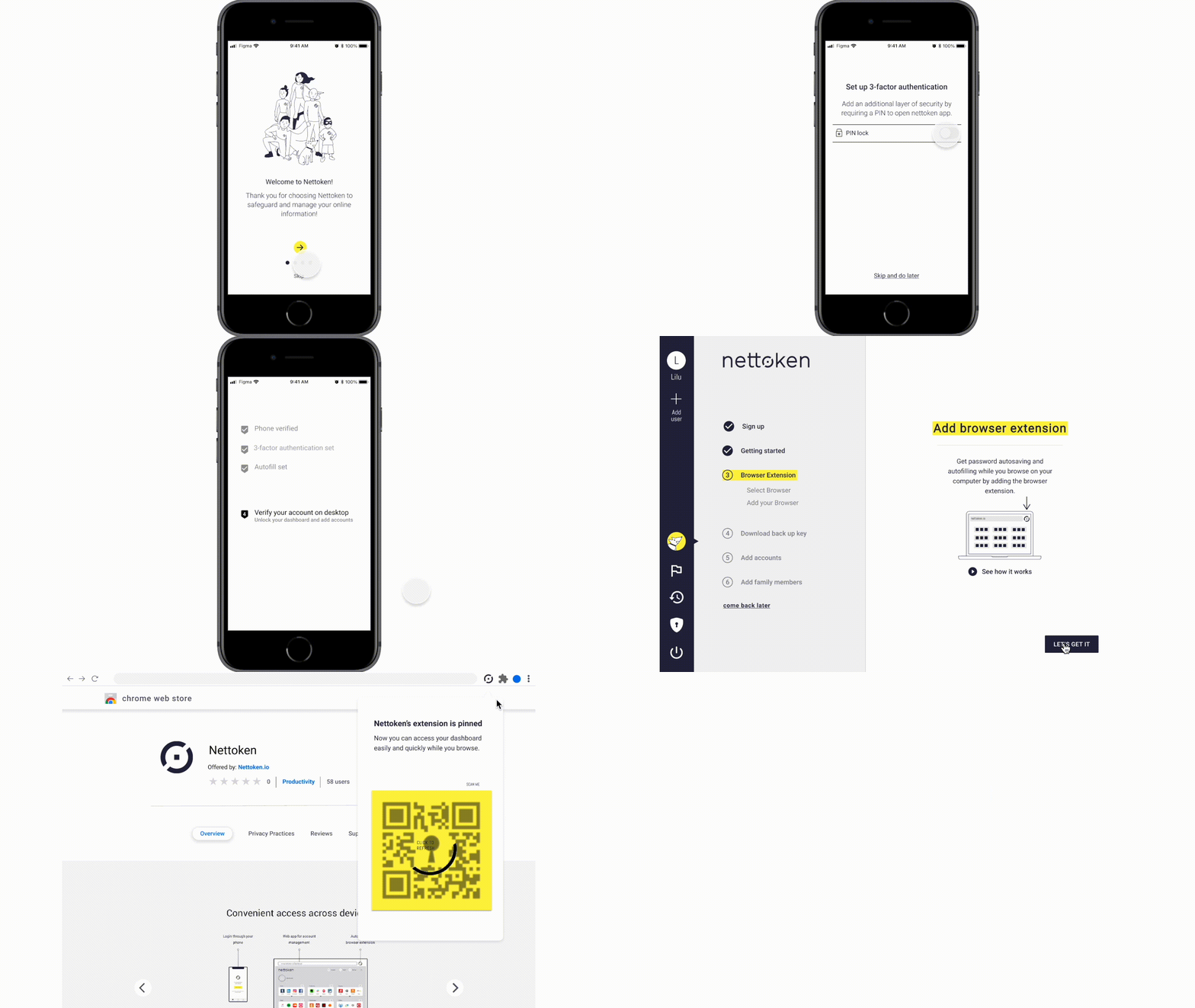
“Very simple and easy to follow!”
“Very intuitive!”
From testers
At the initial usability testing, users didn’t feel safe about the product to get on with using it. After the final usability test, we reached the silent positive feedback with no concerns about its safety. It may sound a straight forward iteration but we could build trust with users.
Key Design Impact
Intuitive Onboarding with Desired Information and feedback
The new design demonstrated a huge improvement from the current one. Switching devices was no longer so confusing with simple explanations about both why and how. The process became much more intuitive with feedback. It also became clear that a phone is the two-way authentication key.
All Hidden Features Became Accessible
To keep the process concise, the current onboarding skips some safety feature settings. That resulted in wariness about the product. So we integrated all the hidden features to convey its trustworthiness.
Personalized Suggestion Based on the Current Management Style
During the initial usability testing, we found out that a method of adding accounts by email arouse different reactions; some were excited and others skeptical. So we designed a personalized suggestion with a simple questionnaire about the current method of password management. In the way, user will no longer go through unnecessary apprehension.
Checklist on Dashboard to Visualize the Process
Blank space on the dashboard made users disoriented and apprehensive after log in. With a checklist along with feedback, user now knows what’s done and next. The design was kept clean by minimizing to only crucial information — instructions of tasks and their benefits. In the way, they don’t get overwhelmed by the lengthened process.
Behind the Scene
1
KICK-OFF
We kicked off this project with the first client meeting. We got a good understanding of the Client’ vision, needs, design brief, and constraints as below:
BACKGROUND
- The number of online accounts per person surged due to the Covid pandemic.
- Age Appropriate Design Code will be effective from September in 2021 in the UK.
- Nettoken is now adding family features to the current product and seeks other opportunities in digital parenting.
PRIMARY OBJECTIVES
- Intuitive onboarding for parents and children.
- Digital parenting features for children ages 5 to 13.
TARGET
Families with children ages 5 to 13, whom the Client calls “everyday” people.
BRAND’S TONE
The friendliness that still balances trustworthiness and credibility to appeal to younger generations.
TECHNICAL HIGHLIGHT
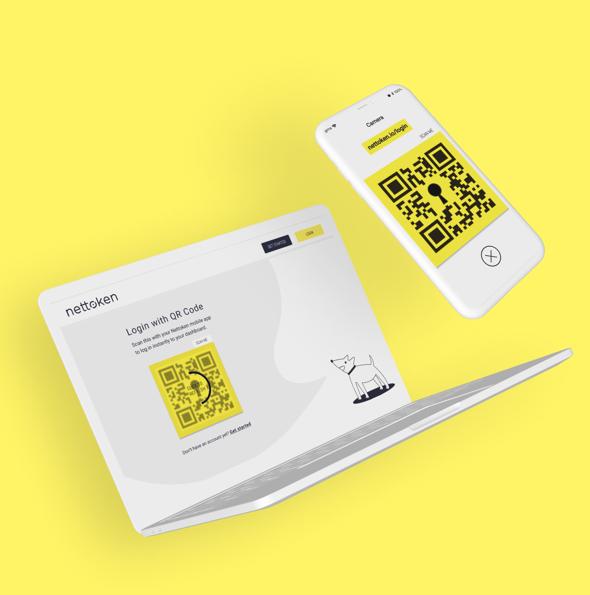
- Use of a cell phone as a two-way authentication key.
- No master password or secret key.
- Adding accounts by scanning metadata in an email account.
- No tracking personal data.
TECHNICAL CONSTRAINT
- One of Nettoken’s technical highlights is no tracking users, which means there is no google analytics data.
2
RESEARCH
After the first meeting, we were already aware that the brief was quite big for a three weeks sprint. So we decided to quickly get on with the research to prioritize the objectives first. We did user interviews, a survey, competitive and comparative analysis, and usability testing.
USER INTERVIEW
Parent’s Concern is Not Yet on Online Security
We began with the list of interviewees from the Client. We conducted interviews on 6 parents with children ages 5-11 to understand the needs and concerns of parents for their children’s online activities and the security of personal data. Unfortunately, none of them were current users.
KEY INSIGHTS
Kids ages 5-11 already well served with currently available tools.
Parents feel uninformed about their own online security.
Parents don’t know when and how to teach their children about security.
SURVEY
How Users Find and Feel About a Password Manager
Simultaneously, to understand trends toward digital parenting and password managers, we conducted a survey on 59 people with Maze, which is the latest remote survey tool we were excited to try out.
KEY INSIGHTS
62% of people decide which password manager to use by recommendations from others.
Master Password or Secret Key, two-factor authentication, and third-party review make users feel safe.
The amount of work to add accounts demotivates users from using a password manager.
USABILITY TESTING
Users Don’t Feel Safe About Nettoken After Onboarding
Additionally, we tested the usability of the current onboarding with three households. Coincidently all of them happened to be with a partner who has extensive technical knowledge.
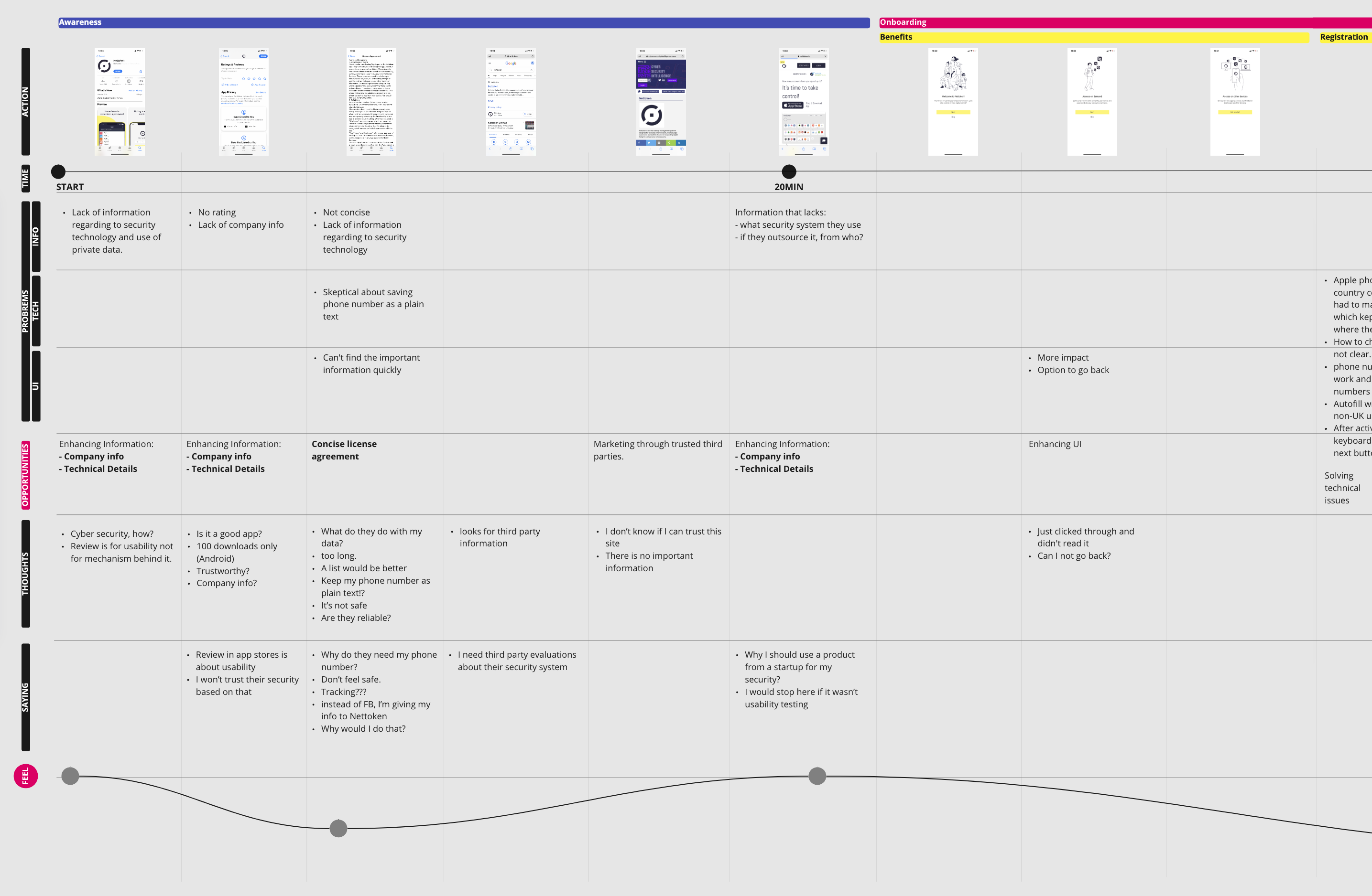
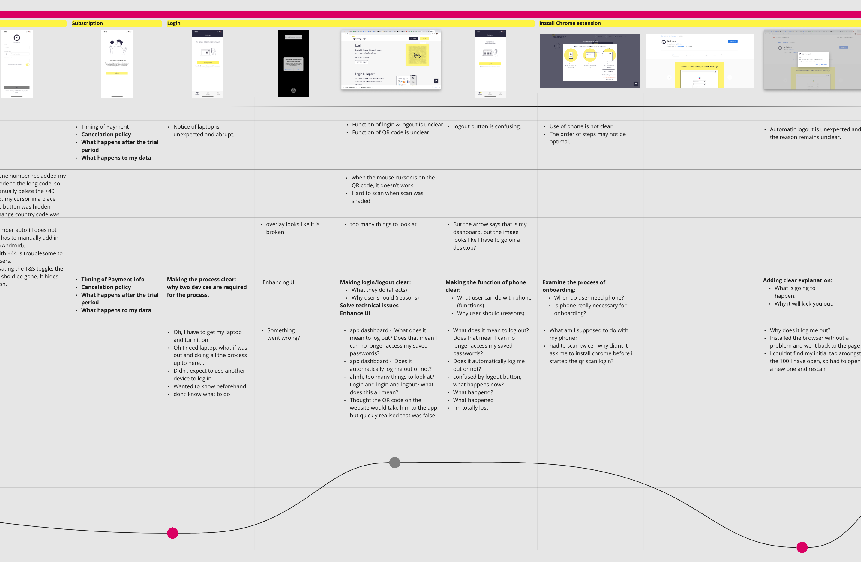
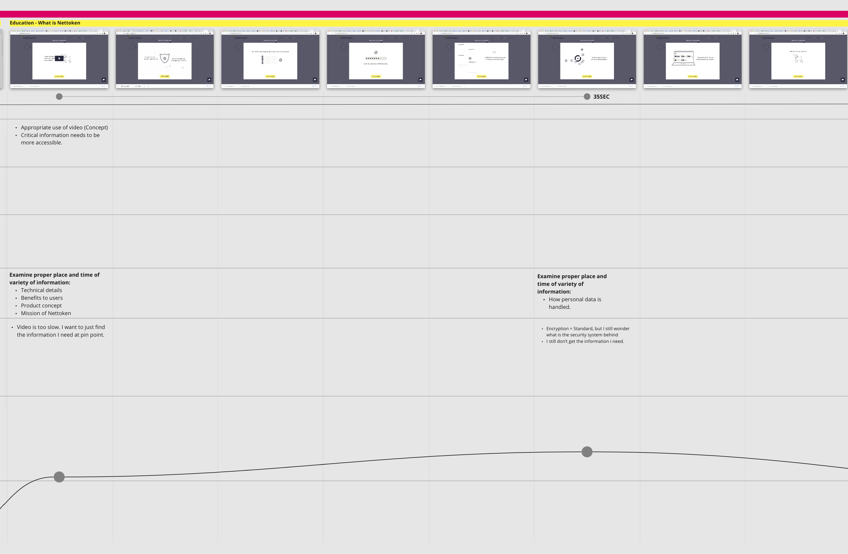
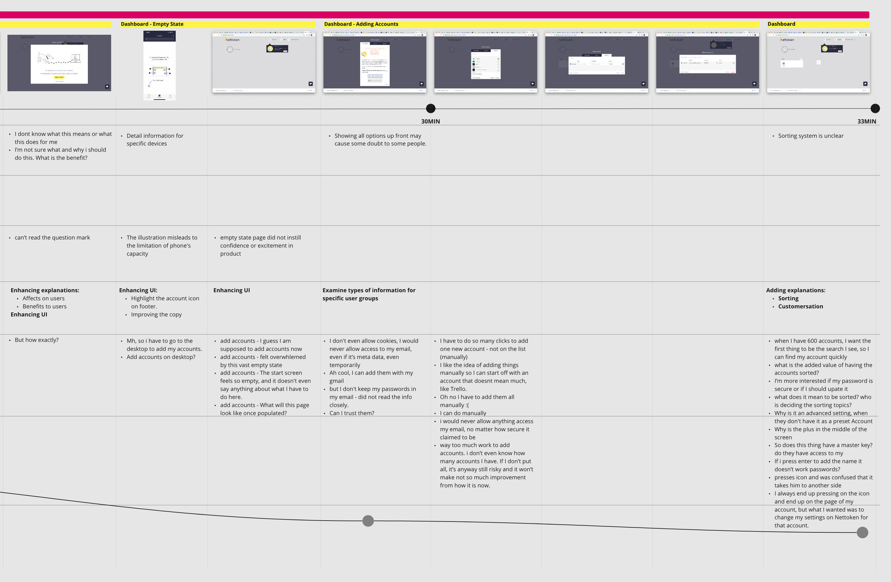
From the results, I developed an extensive user journey to synthesize emotions, thoughts, sayings, problems categorized into information, technical, and interface design, opportunities to Client, and time required.
KEY INSIGHTS
Testers didn’t understand why they had to do setting up tasks and became confused and skeptical.
Switching devices from mobile, desktop, chrome web store back to desktop, made testers disoriented.
Testers were left with confusion and questions after onboarding due to a lack of guidance.
3
DEFINE
The second meeting was supposed to be a design studio session to brainstorm possible solutions. However, we asked the client to have a workshop instead to agree on a problem to tackle for this sprint. They supportively accepted the schedule change.
A Way for Parents to Feel Confident in Creating a Safe Online Space for the Family
What is the Problem?
We proposed Client focus on onboarding as it was the most urgent problem to Nettoken’s business. We believed that improvement in onboarding would bring impacts on the largest number of users.
For Whom?
Even though the Client initially showed interest in parents and children, for this sprint, we decided to focus solely on parents as they are the gatekeepers in the family. If parents can onboard themselves, they will be able to teach their children as well.
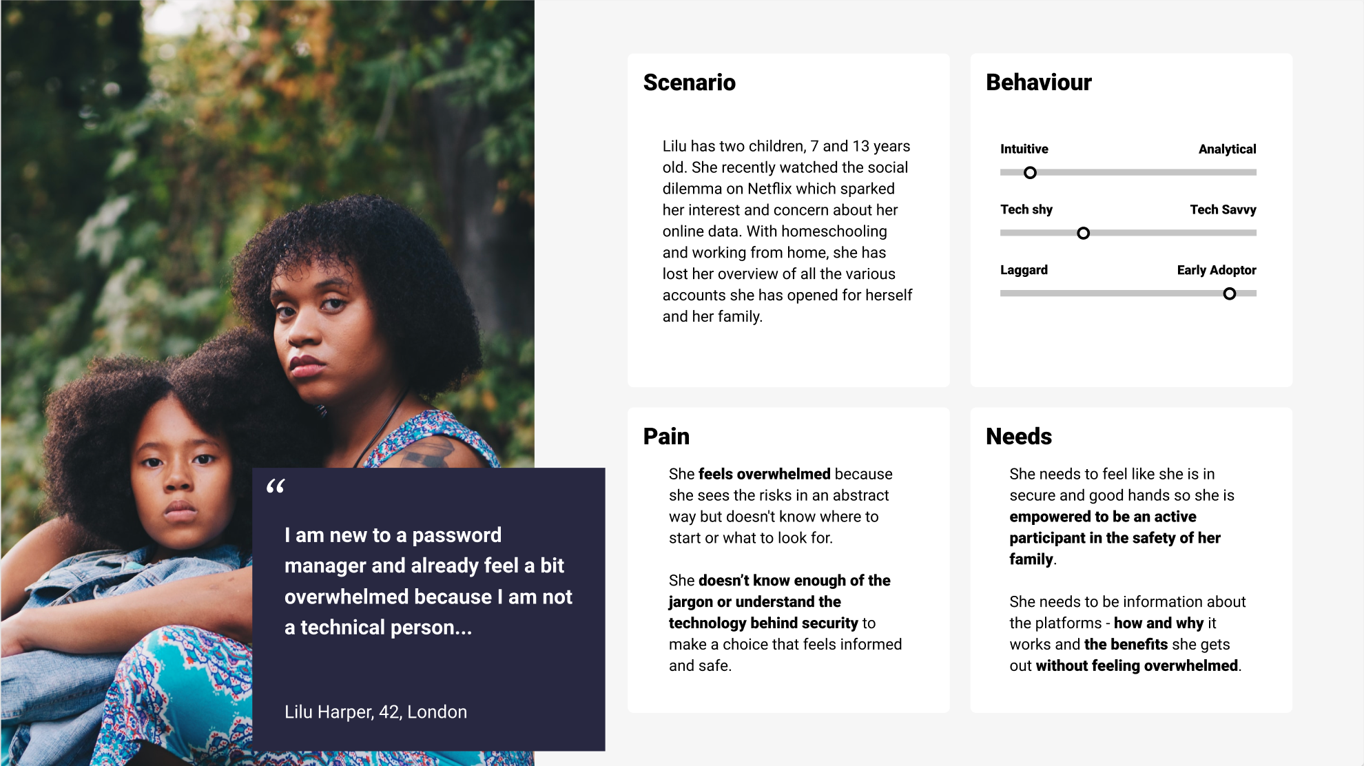
So, we developed our persona.
LILU HARPER, 32, LONDON:
Doesn’t know enough knowledge about online security.
Doesn’t know enough jargon and feels overwhelmed.
Wants to feel an active participant in the family to protect the family members online.
4
DESIGN
Our design process started with getting ideas and insights from the Client through a Design Studio. Then we developed the insightful ideas further into sketches and prototypes to test with users.
Everyday People Don’t See the Risk
I felt that an important piece of the puzzle was still missing. Even though we created Lilu who wants to have control over her online accounts, none of our interviewees showed a keen interest in online security. So I didn’t see the bridge between our target and the product. To design further, I needed to know why they don’t want to get bothered by the use of a password manager. So, I decide to conduct five additional interviews with those who have used a password manager app but stopped using it.
KEY INSIGHTS
All concern financial fraud.
They don’t take preventive action as frauds would be insured by financial institutes.
They understand the risk but see no reason why an individual would be targeted by hackers.
I realized that people have a hard time seeing the risk that they never faced. But when I asked about frustrations around passwords, they suddenly became more expressive. Some voluntarily said that they would be willing to pay for the service.
PROBLEMS AROUND PASSWORD
Time to reset a password.
Typing email address and password.
Worrisome thoughts about failing to log in.
Nettoken as a Security Tool or a Productivity Tool?
Although The Client assumed that everyday people are reluctant to take action because they find it too complicated, we found out that they simply don’t see the problem. This led us to suggest the Client considering the new approach as a productivity tool. However, for this sprint, we went along with the current position.
DESIGN CONCEPT
An Informative Tribrid Onboarding to Build Trust
To redesign the current onboarding, we examined the following:
USER FLOW:
To implement all hidden safety features and solve disorientation and apprehension.
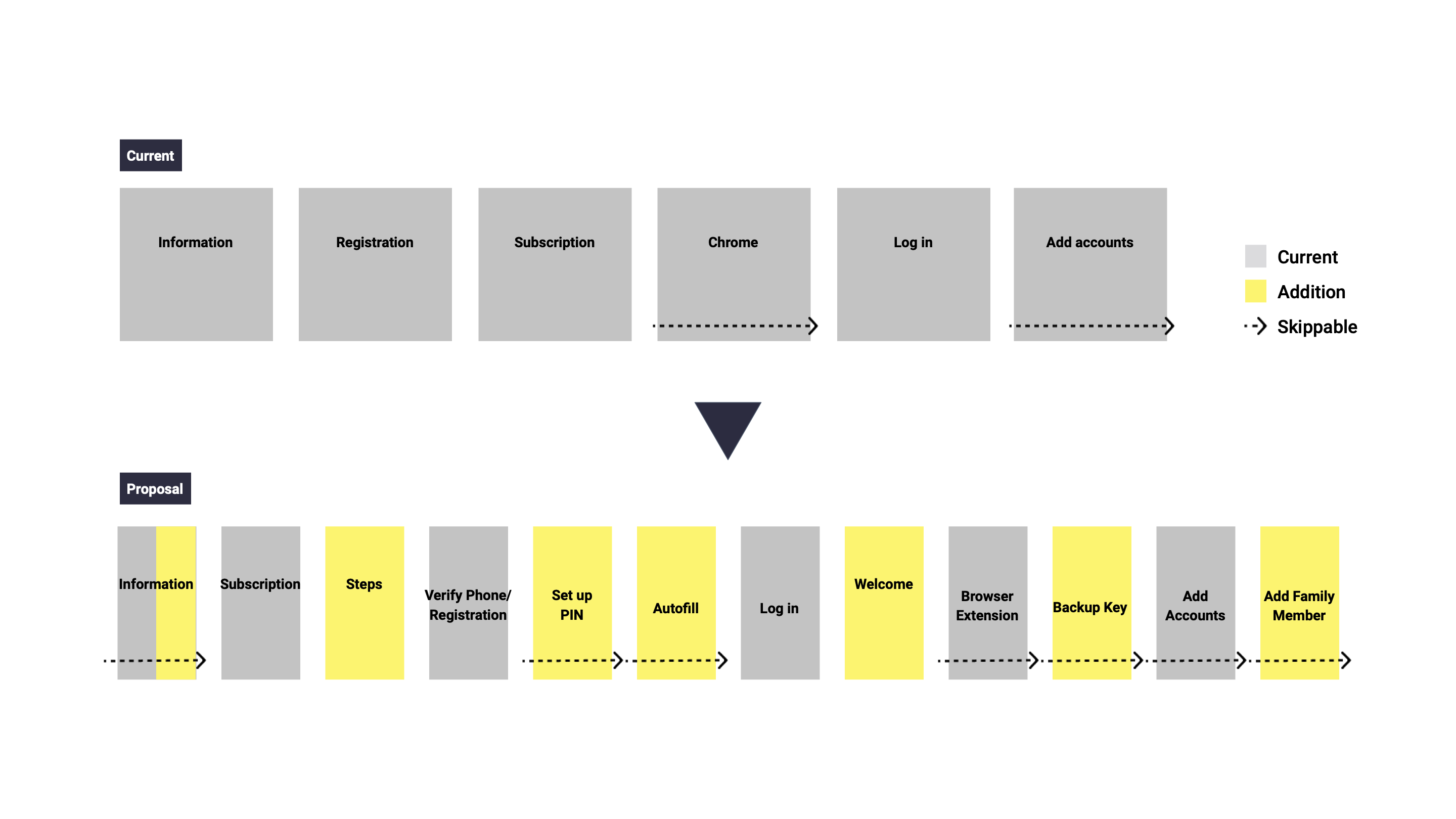
INFORMATION ARCHITECTURE:
To improve accessibility and timing of information.
USER INTERFACE:
To improve communication including design layout, accessibility, and use of the keywords from the survey.
5
ITERATE
To get our final design, it took us two usability tests, three design iterations, and redefining our persona Lilu before the final iteration.
The Majority of Everyday People Never Used a Password Manager for Their Household
While talking with my team, I saw Lilu was apparently different from each of us. So I asked a question if she is new to a password manager. As expected, the answers were different among us. So, we looked into our survey result and redefined Lilu — a 42 years old mother who never used a password manager. This fine adjustment led us to more effective design discussions afterward.
User Interface Iteration
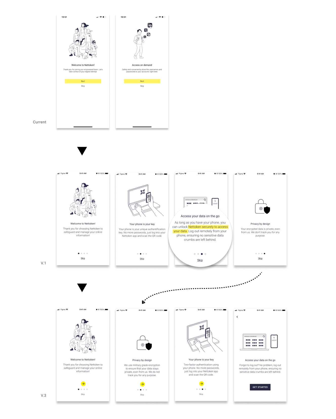
Now I will quickly walk you through our design iteration for mobile and desktop.
No More Disorientation by UX Writing
- The log-out button on the mobile did not clearly indicate that it would log out from the desktop. So we re-labeled the new button ‘Log Out Remotely’.
- Unlike the dashboard on desktop, its function on mobile was limited as a key. This misalignment was confusing. In the new design, we re-labeled the menus as Key Phone and Dashboard.

No More Apprehension by Information Architecture
- We added data policy and conceptual model of the product.
- A skeptical tester felt unease with a copy related to personal data before Nettoken’s data policy. So, we brought it forward to avoid unnecessary apprehension.
Smooth Flow by Animated Feedback
- The highlight in the progress bar was not clear about whether it’s the complete step or the next one. We animated feedback to clarify.

No More Overwhelm to Add Accounts
- To avoid unnecessary apprehension, we created a quiz to personalize suggestions for an adding method. But testers didn’t understand what it was for. We added an explanation to clarify.
- A tester expressed excitement about adding accounts while browsing. until then he thought he had to do it all at once. So, to ease such stressful expectations, we added an intro.
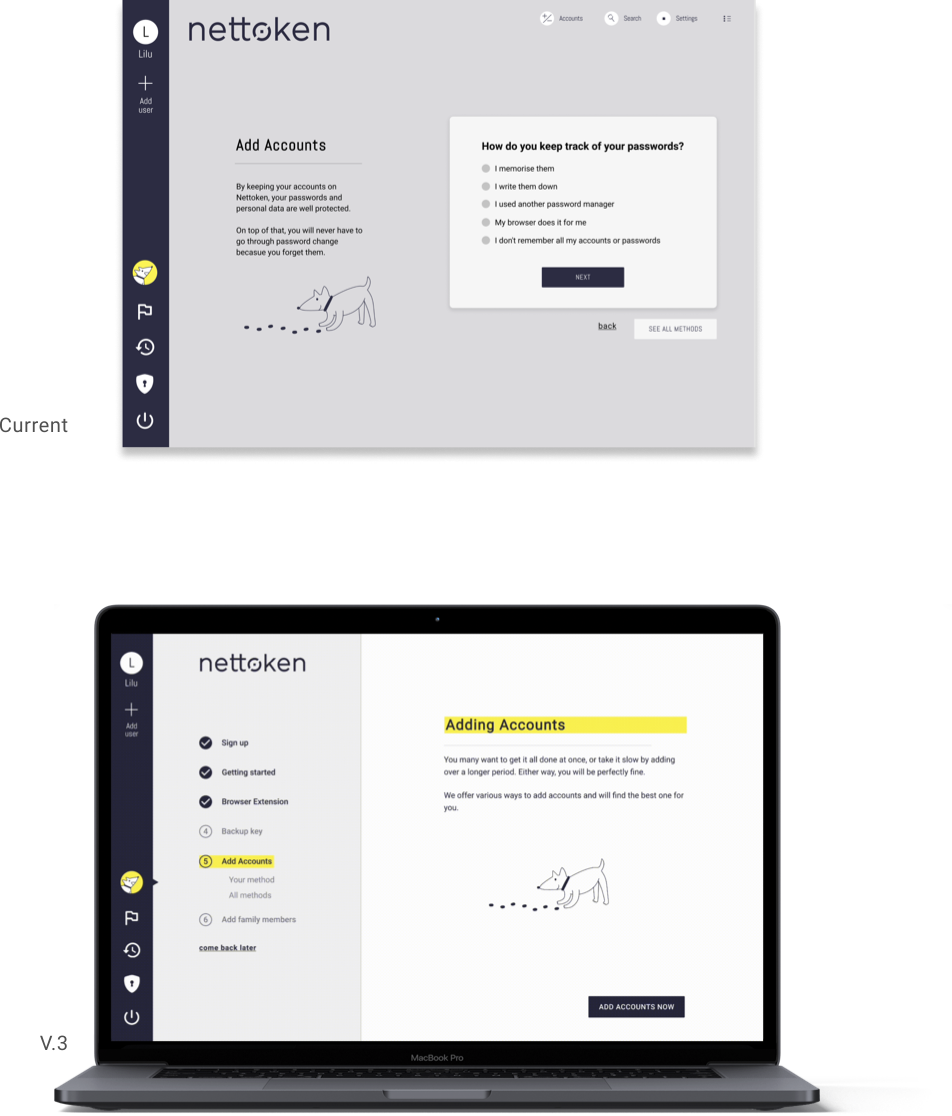
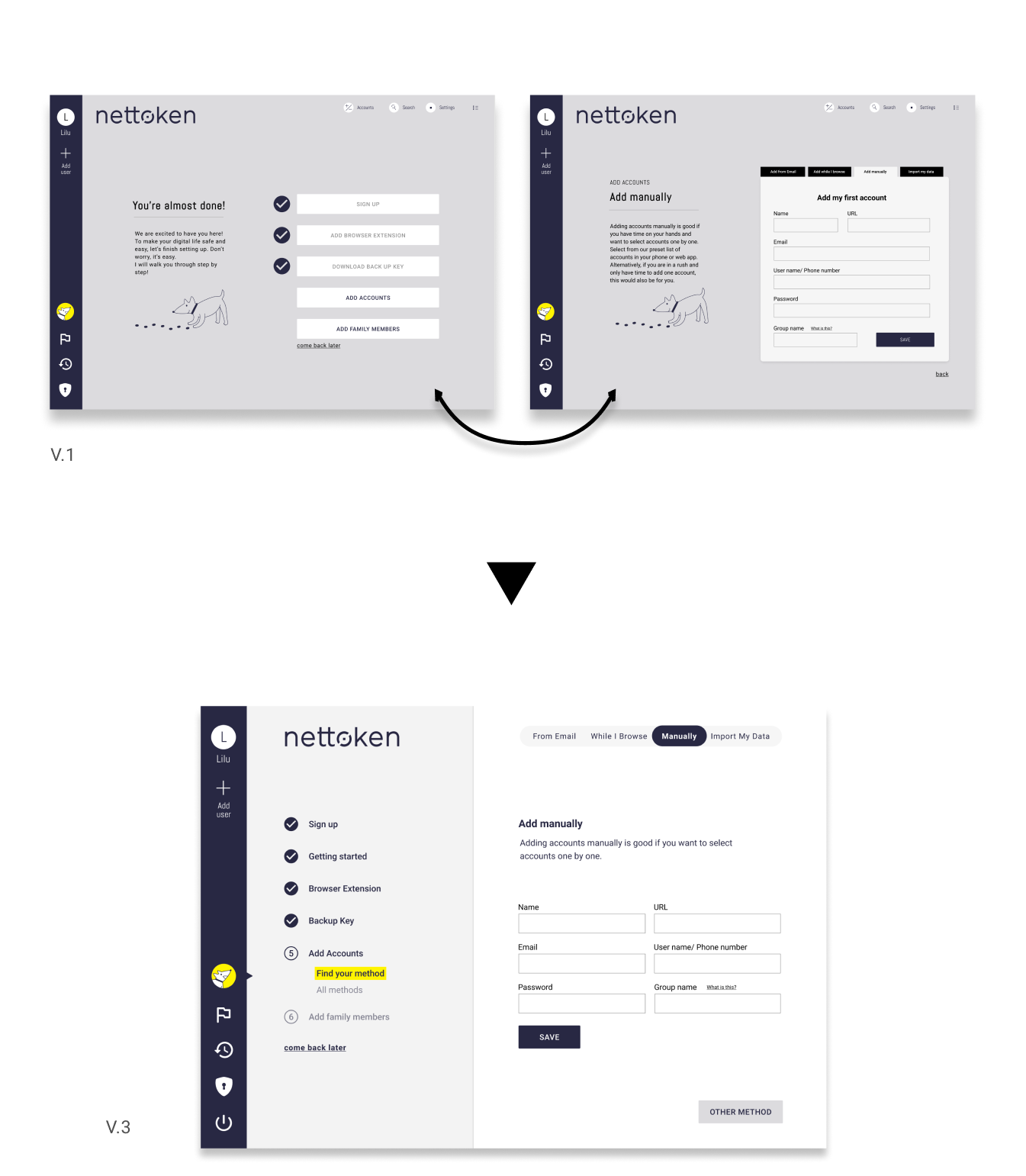
Stay on Track with Checklist and Feedback
- Testers didn’t read the writing on the left column and felt that transitions between the pages of the checklist and instructions slowed down the process.
- We relocated the fixed checklist on the left column and all information on the right. As that reduced the writing space, we simplified writings.
Intuitive Log-out Based on User’s Conceptual Model
- Re-labeling the logout button on mobile wasn’t enough as testers expected to log out directly from the desktop app as well. So we added a new log-out button on the desktop for flexibility.
6
FROM HERE
At our final presentation, we suggested the following:
NEXT STEPS
Considering a new approach: Nettoken as a productivity tool.
Another usability testing on our final prototype.
Landing page.
AREAS TO EXPLORE
Third-party credentials and user reviews to strengthen the credibility.
Children over 13 years old can be a blue ocean for digital parenting and parental controls.
7
KEY LEARNINGS
This client project taught me the following important lessons:
Regularly UX research is important to update understanding in the landscape of the market and user. That has a huge impact on not only the usability of a product but also business direction.
A data-driven design foundation is so critical, especially working as a team. At times persona was overlooked but its redefinition solidated our design ground to make clear design decisions.
Good recruitment for user interviews and testing is a key to get fruitful insights. We all have biases and gain basis along the process. At our initial usability testing, we had testers with extensive technological knowledge by chance. At times that got us deviated from our main objectives — an easy and simple onboarding.
8
AFTER THE STORM
This project definitely made me tongued up and ready for uncertainties and ambiguities of real-world challenges. We were also so flattered by the compliment from the Client — “We’ll hire all of you!”


