Sending a Joyful Growth to The Loved Ones
Toy shopping is special for children. That’s because it’s not about getting a toy. Rather it’s about receiving a gift filled with excitement and love. Actually, it’s not all about excitement and love. There is more to it. My research revealed the deep desire of the gift givers. So I challenged to create a website that can assist customers to easily reach it.
Project Summary
OVERVIEW
Date: February 2021
Type: Conceptual Project
Duration: 2 Weeks
Team Size: 1
Setup: Remote
Device: Desktop
Scope: E-commerce Website Design
Constraints: No Real Customers Available
ROLE
I solely worked through the entire design process, Double Diamond. However, my focus was on research and UI design.
UX SKILL
- Screen Survey
- User Interviews
- Affinity Mapping
- Usability Testing
- Competitive/Comparative Analysis
- Persona
- User Flow
- Information Architecture
- Card Sorting
- Prototypes
CHALLENGES
- I faced the emerging needs of parents but couldn’t find any precedence.
- The test result on the design concept was not immediately clear at first.
- Responsive design.
- The proportion among components.
RESULT
Deliverables:
- Research
- Persona
- User Flow
- Information Architecture
- Prototype
By displaying products with the desired information, customers see the quality clearly and happily move to purchase.
KEY LEARNING
- UX research to validate/invalidate my own assumptions.
- The holistic approach of UX research to efficiently reach the best solution.
- Competitive/Comparative Analysis to establish the positioning and collect remarkable precedence.
- Card Sorting to align to user’s conceptual model.
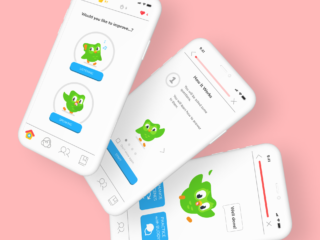
Final Prototype

“I like it! I feel good about buying toys here.”
From a tester
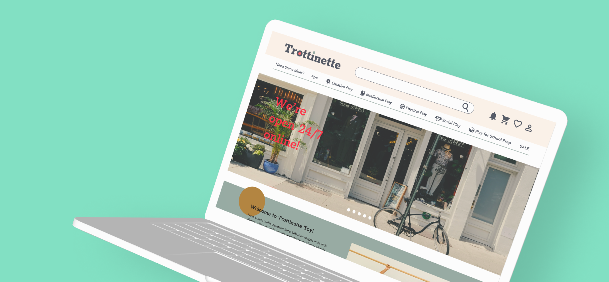
Trottinette Toys’ new eCommerce website now offers an easy one-step solution to find the best gift for loved ones. Now customers no longer have to go to Google to find ideas. Instead, they can go straight to the Trottinette Toys’ website for their thoughtful recommendations. Once they find something, they can easily share it with the parents of the children. In conclusion, the new website gives better customer satisfaction through user-oriented solutions and authentic UI design to represent who Trottinette Toys is.
Key Design Impact
Align sorting to Customer’s Need and Desire for an Easy Navigation
User interviews showed gift-givers want to present “educational” toys that help children to improve their skills such as creativity, logical thinking, motor, and social skills. So, Sorting products based on these skills give customers a shortcut to the ideal gift.
Trustworthy Curation to Cut the Time of Research
Trottinette Toys’ selective recommendations are not sponsored by toymakers. Each recommended item has its own unique label and customers can quickly choose from the small number of collections.
Informative Product Description to Make Purchase Without Visiting a Physical Store
Gift-givers pay close attention to product descriptions, especially the safety of materials and functions. However, quite a few people visit a physical store because there is not enough product information on the website. Informative product description allows customers to go straight to buy online with no worrisome.
Behind the Scene
1
DESIGN BRIEF
Trottinette Toy has been in the business for 25 years in the district of Seefeld, Zurich, Switzerland. They have grown a deep root and a solid bond to the local community. Unlike eCommerce retailers such as Amazon, they offer a highly curated inventory focusing on hand-picked quality over price.
BACKGROUND
Due to the COVID-19 pandemic break out a year ago, Trottinette Toys saw an opportunity to support the local community by allowing people to order some products online. They built their website but are not pleased with the results. They have plenty of website visitors yet few completed purchases.
PRIMARY OBJECTIVES
An improved eCommerce website to
- effectively showcase their curated products.
- maintain their brand image as a “small quality shop”.
- make great customer service visible and accessible.
TARGET
Trottinette Toys has a wide range of customers. But the main target is the local young families who value high-quality toys and good customer service. They also like supporting small local businesses in their neighborhood like Trottinette Toys.
2
DISCOVER
COMPETITIVE ANALYSIS
Does the Market’s Standard Really Cater for Trottinette’s Customers?
I began with the competitor analysis on retail giants such as Amazon, Target, and Toys R us, and local retail stores for babies and children such as Smallable, Franz Carl Weber, and My Snowflake.
KEY INSIGHTS
There are two ways of global navigations; one based on the product category and the other based on the user category.
Large retailers often have global navigation based on the user category.
Toys R us is transparent about sponsored products.
Curation pages from most of the competitors don’t personalize for the users.
UI designs of children’s concept stores target adults rather than children.
FEATURE ANALYSIS
To Cover the Market’s Standard and More
The feature analysis on them gave me ideas about the standards of eCommerce in the toy industry today.
KEY INSIGHTS
Must Features:
Search, customer service, recommendation, social media, e-gift card
Interesting Features:
Associate products, favorite, curation, Gift wrapping, registry
Local small businesses use blogs as the marketing medium.
USER INTERVIEW
The Desire for an Educational Toy that follows Parent’s Ideological Preference
After the competitor analysis, I moved on to user interviews. After screening with Google Form, I saw there are two kinds of consumers, namely parents and gift-givers including aunts and uncles. Therefore, I did three user interviews with parents and another three with aunts and uncles.
KEY INSIGHTS
- 6 out of 6 defined high-value toys as “educational” toys that help children to improve their skills such as creativity, logical thinking, motor/athletic skills, and social skills.
- 6 out of 6 do an internet search for gift ideas first and then find stores that carry the item.
- 4 out of 6 think it is not easy to find quality toys online because there are too many products out there and they don’t know which source they can trust, doubting it as a marketing ad.
- 3 out of 3 gift-givers strongly care about the preferences of the parents as much as gift-receivers. They talk to the parents several times before making a purchase decision.
- 3 out of 3 prefer visiting a physical store to an online store because they can easily perceive more information about the available options and product information such as quality and function.
- Emerging preferences such as sustainability, inclusion, and gender-neutral surfaced regularly.
3
DEFINE
PERSONA
A Gift-Giver who Wants to Give Joyful Growth to Children
Although I initially set two user groups of parents and gift-givers, after the user interviews I came to realize that lots of purchases even by parents are actually for gifts to children outside their household. Therefore I developed a persona of Vincent, a young professional who is an uncle to many nieces, nephews, and his godchildren.

USER JOURNEY
Online Research Takes Lots of Time
UX design being an agile process, I needed to define the first problem to tackle. From Vincent’s user journey, I defined Trottinette Toys’ opportunity to improve the experiences between research and decision-making. These are Vincent’s frustration points:
VINCENT’S FRUSTRATION POINTS:
- Finding good ideas on Google.
- Too much information makes decision-making difficult.
- Asking the children or their parents for advice.
- Going to a physical store to check the quality.
- Check with the parent’s approval.
- Going to the store website to order.
VINCENT’S USER JOURNEY
The research is the most frustrating phase.

4
DESIGN
Our design process started with getting ideas and insights from the Client through a Design Studio. Then we developed the insightful ideas further into sketches and prototypes to test with users.
HOW MIGHT WE….?
Why is it So Hard to Find Good Ideas Online?
I came up with the following How Might We statements, wondering the question.
- How might we make the discovery process as easy as possible?
- How might we make it easier for Vincent to share ideas among the children and their parents about a product?
- How might we inform Vincent about products well without visiting a physical store?
- How might we categorize products, aligning with the users’ needs and desires?
- How might we showcase a trustworthy curation?
DESIGN CONCEPT
Realignment to Customer’s Needs by Categorizing Product Based on Developmental Skills
As a small local business, Trottinette Toy already has established solid trust with existing customers. Therefore, I saw it appropriate to have a website where the customers can experience in-store-like experiences such as walking into a store, getting greeted by the shop staff, perceiving the ambiance, getting their recommendations, and finding a perfect present.
The user interviews suggested that the conventional way doesn’t lead users to “quality toys”. That’s because it doesn’t align with the needs and desires of users.
The insights of the user interviews made it clear that all parents, aunts, and uncles desire to find “quality toys”. After digging into its criteria, “quality toys” turned out to be “educational toys”. Then I dug even deeper to understand what “educational” means to each interviewee. Finally, I concluded that “educational” toys are to help children to improve their skills such as creativity, logical thinking, motor, and social skills. So, I decided to design a website based on these skills instead of a product category or user category.
By doing so, I believed that there would be two benefits; it appears more promising to find their desired products and all toys now have the appeal as an “educational” toy through the skill-based category.
5
ITERATE
USABILITY TESTING 1
Can Users Find a Gift Through the Navigation Categorized Based on Developmental Skills & Activities?
After developing the design concept, I needed to test it by usability testing. I quickly sketched basic pages to illustrate the flow and tested it with six people by Marvel App.
TASK:
Find a gift for a five-year-old niece.
RESULT 1
All Testers Got Good Impression from the Navigation
All participants succeeded in the task with no major obstacle though it took a little bit longer to scan the unfamiliar global navigation. At the end of the testing, I asked specifically about the global navigation based on skill-based categories, all of them got a positive impression from it.
However, they also indicated a need to filter age at the earlier stage.
ITERATE 1
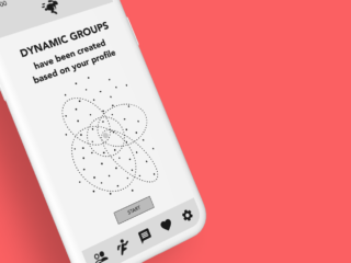
The Global Navigation Remains with an Additional Age Slider
I iterated the prototype into a mid-fidelity, reflecting Result 1. I kept the global navigation based on skill-based categories but added a dropdown menu with an age slider with which users can filter age before the rest of the filters.

USABILITY TESTING 2
Can Users Find a Gift Through the Navigation Categorized Based on Developmental Skills & Activities?
I conducted usability testing on the iterated prototype with four people.
TASK:
You are invited to the birthday party of your boss’s daughter (6 years old) on short notice. Your boss cares a lot about gender issues and you want to avoid gender-stereotyped products. Find a quality gift and wrap it by the end of the day.
RESULT 2
People are Impatient and Skeptical toward E-commerce
THE GLOBAL NAVIGATION
- 2 out of 4 still looked for age in the global navigation first.
- 2 out of 4 found ‘Recommendations’ negative and hesitated to try it out.

RECOMMENDATION
- 1 out of 4 thought the page of recommendation would be too long and went straight to filters before scrolling down to glance at the products.
- 3 out of 4 couldn’t locate the filter of ‘Gender Neutral’ under ‘Sustainable’.
- Sizes of imagery, buttons, and white spaces were too large.

ITERATE 2
Making Curation Quickly Personalized with Navigation and Filters that Align with the Needs
I iterated the prototype into a high-fidelity, reflecting Result 2.
THE GLOBAL NAVIGATION
- Menu ‘Age’ was added to the global navigation.
- Symbols were added to menus on the global navigation for easier visual recognition.
- Menu ‘Recommendation’ to a wording based on users’ perception ‘Need Some Ideas?’

RECOMMENDATION
- The specific number of listed items was added to the page ‘Need Some Ideas?’ to break the users’ assumption of too much information.
- Filter category ‘Sustainable’ was changed to ‘Ideology’.*
- The UI design was carefully adjusted.
For the wording for the category name of filters ‘Eco’, ‘Inclusion’, ‘Gender Neutral’ and ‘Traditional’, I tried to find out how the competitors handle it. In vain, no one had such filters that eliminate certain products. In the case of usability testing 2, the filter ‘Gender Neutral’ was to eliminate gender-stereotyped colors and products. Then I also checked articles related to the topics but couldn’t find any suitable wording. Some words sounded too political. So here I placed a temporary wording ‘Ideology’. For the next round of iteration, I shall find better wording by doing card sorting.

6
NEXT STEPS
Another iteration with a revised filter followed by usability testing.
Share feature for gift registry and favorite items.
7
KEY LEARNINGS
This client project taught me the following important lessons:
When I started working on the project, I thought it would be a straightforward E-commerce website where I can just follow some good practices in the industry. However, user interviews revealed the misalignment between the conventional navigation and the users’ needs and desires. User interviews are so crucial to validate/invalidate my assumptions. And I really enjoy encountering surprises.
The Holistic approach to UX research with various methods including competitor analysis and card sorting makes it possible to create a simple yet efficient solution.
Competitive/Comparative Analysis to establish the positioning helps to hold a clear vision and objectives in the design process.