To Improve the Fluency of Speaking with Duolingo
We all fancy learning a new language. Some dream of chatting with local people on a trip; other of presenting work in a foreign office. The reason may differ but the goal is the same – being able to confidently speak the language in an authentic situation.
My team and I researched and designed the solution to attain the goal as quickly and enjoyably as possible by adding new features to Duolingo’s mobile application.
Project Summary
OVERVIEW
Date: March 2021
Type: Conceptual Project
Duration: 2 Weeks
Team Size: 4
Setup: Remote
Device: Mobile
Scope: Adding New Features
ROLE
Each of our team members took a part in all steps of the design process, Double Diamond. However, my focus was on research and information architecture to build the design’s structure. I promoted design discussions in the team to build a strong design foundation.
Team Members:
Alice Marks
Eliza Edwards
Hugo Altendorf
UX SKILL
- Screen Survey
- User Interviews
- Affinity Mapping
- Usability Testing
- Competitive/Comparative Analysis
- User Flow
- Information Architecture
- Site Map
- Design Studio
- Wireframes
- Prototypes
CHALLENGES
- Broad suggestions of new features in the design brief.
- Lack of progress after reaching a certain level.
- Lack of speaking lessons.
- Lack of realistic setting.
- Lack of recognition on improvement in speaking skills.
- Integration of new features to the current app
RESULT
Deliverables:
- Research
- Personas
- User Flows
- Site Map
- Wireframes
- Prototype
New features were added after restructuring the information architecture. As a result, they are intuitively accessible and enhance the learning experience for users at all levels.
KEY LEARNING
- In UX research, it is important to evaluate and prioritize the collected data.
- Research data should be easily readable to all team members. Otherwise, the design won’t fully reflect it.
- Understanding the priority of user needs is crucial to evaluate the features.
- Project management and the early establishment of ground rules in a team.
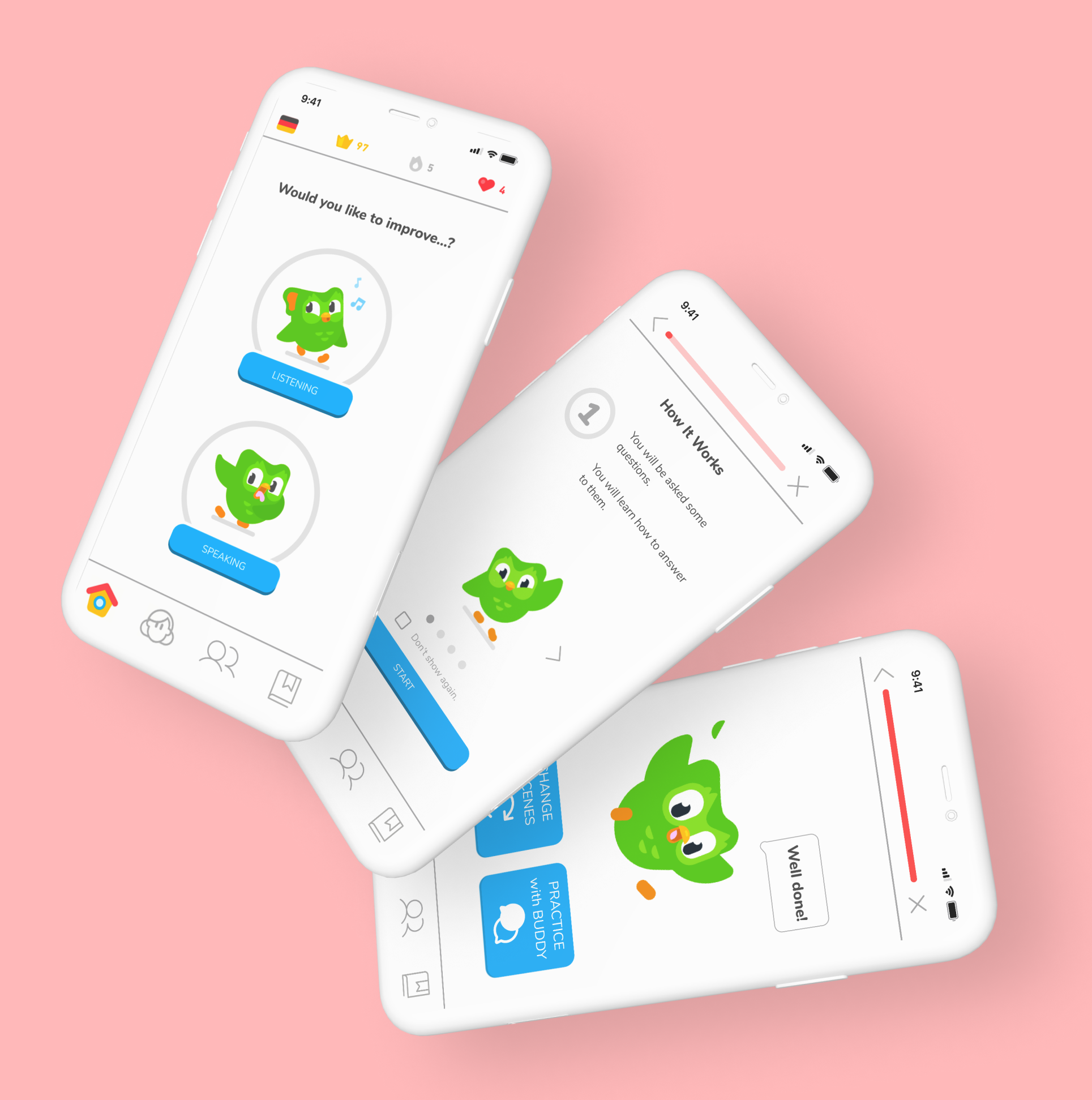
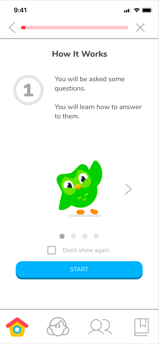
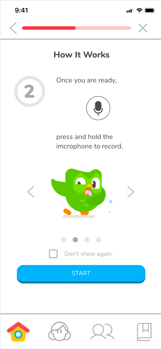
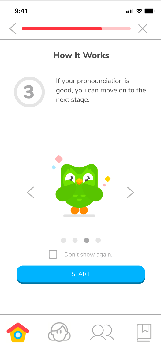
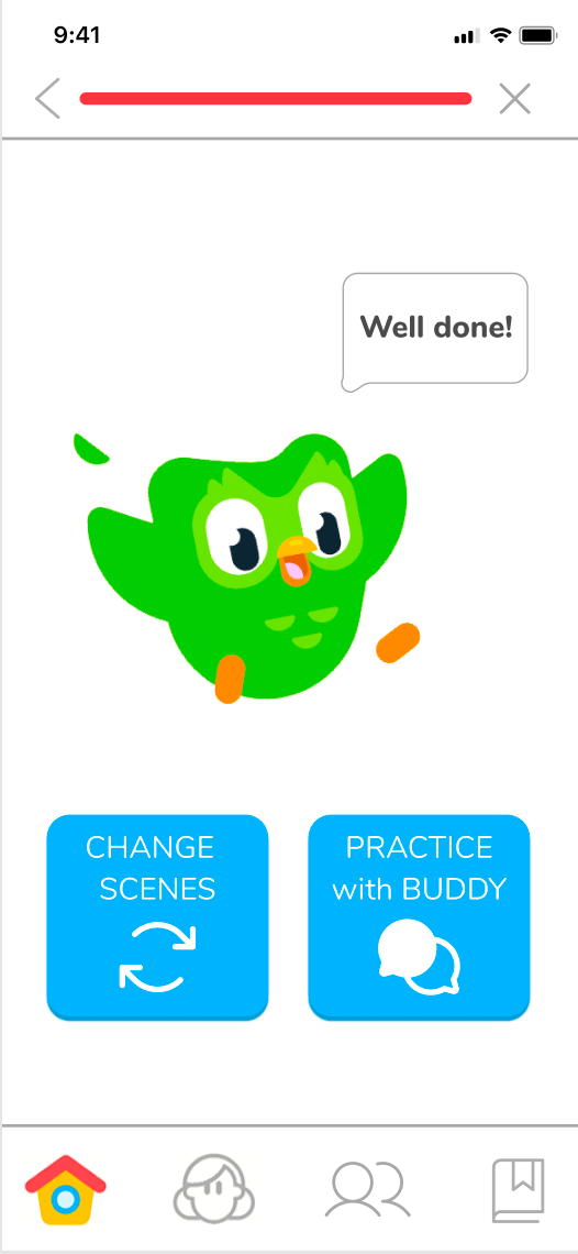
Final Prototype

Walk-Through
“I’m more motivated to learn to talk with a native speaker!”
From testers
We added new features – the contextual role play and the matchup with native speakers to practice speaking – to enrich the user experience by providing users of all levels with contextual or realistic settings to test their learning. A casual user can enjoy the simulation by role-playing games, and a serious user can connect to native speakers to carry out some conversations.
Key Design Impact
Speaking Lessons for Learners at All Levels
Although language learners all desire to be able to speak with locals, Duolingo’s speaking lessons are currently very limited. The shortage becomes even more critical to advanced learners. Users want to reach the goal by feeling confident to speak to locals. To feel confident, they need to practice in realistic situations.
Practice Useful Phrases and Pronunciations
The new feature – the contextual role play allows beginners to comfortably practice useful phrases and pronunciations with audio assessment in realistic scenes animated with Duolingo characters. Unlike the current Story, there is a chance to actively speak up to a microphone to check one’s pronunciation.
Practice with a Native Speaker Once Ready
The new feature – match-making with native speakers allows users to practice speaking in a real conversation with native speakers. They can freely improvise conversations and expose to a real regional dialect one may encounter at their destination. Especially, for advanced learners, it is the ultimate place to practice toward their own goals.
Behind the Scene
1
Design Brief
Duolingo is an American language-learning website and mobile app. The company uses the freemium model; the app and the website are accessible without charge although Duolingo also offers a premium service for a fee.
BACKGROUND
With Covid, Duolingo saw a big increase in new users and current users’ retention. Duolingo has a very active community of online users who often discuss and share their needs and frustrations and suggest features they would like to see on the app.
OBJECTIVES
To improve the user experience by implementing the suggested features from the users:
- To choose/select a particular scene/situation.
- To learn keywords, sentences, pronunciation tips, cultural highlights, and taboos.
- To record themselves as they practice the sentences and store them in the app in case they want to return to them.
- To find native speakers.
- To read key moments in history related to a particular language/culture.
- To access and view native speakers’ profiles.
- For profiles of native speakers to have short videos/stories/reels of up to 2 min with key insights and pronunciations tips.
TARGET
Duolingo users and especially their active community who often discuss and share with the company their needs and frustrations and suggest features they would like to see on the app.
2
DISCOVER
I began with the competitor analysis on language learning apps as direct competitors such as Babel, Mondly, Besuu, Linguistica 365, Memrise, Rosseta Stone and other language learning tools, social media apps, and a game app as indirect competitors such as online tutors, Tandem, language exchange partners, an online game, and Instagram.
COMPETITIVE ANALYSIS
Duolingo Lacks a Feature to Practice Speaking
The feature analysis with a focus on the suggestions from users gave me clear insights about the current market situation – precisely which features are today’s standard and which get Duolingo ahead from others
KEY INSIGHTS
- Half of the direct competitors don’t offer a free service.
- Most competitors include cultural highlights.
- Each competitor has some key feature to differentiate from others such as:
- Contextual conversation practice (Mondly)
- Proofreading by native speakers (Besuu)
- Word lookup by image search (Memrise)
- Slow audio script with quick word lookup (Linguistica 365)
- Live lessons on demand (Rosetta Stone)
- Assessment of pronunciation (Rosetta Stone)
After the competitor analysis, we moved on to user interviews to understand what is Duolingo’s attractive and missing features from the user’s view. So, by screening with Google Form, we intentionally selected two types of users: those who use only Duolingo and those who use multiple language learning apps. We did four user interviews with each group.
USER INTERVIEW
The Ultimate Goal is to Spake with the Locals with Confidence
Simultaneously, to understand trends toward digital parenting and password managers, we conducted a survey on 59 people with Maze, which is the latest remote survey tool we were excited to try out.
KEY INSIGHTS
- 7 out of 8 set the goal of being able to speak to native speakers.
- 7 out of 8 find it effective to listen and speak to native speakers.
- 7 out of 8 set the goal of being able to speak to native speakers.
- 7 out of 8 find it effective to listen and speak to native speakers.
- 6 out of 8 use language learning apps regularly as they know that learning every day is effective.
- 6 out of 8 find it hard to see their progress, which demotivates them to continue.
- 3 out of 3 advanced learners who have used Duolingo find it not challenging enough for improving their learning.
- 3 out of 3 advanced learners who have used Duolingo don’t find its game-like motivations appealing enough to continue.
- 5 out of 8 find it hard to learn grammar and vocabulary.
- 5 out of 8 want to learn a language in a realistic contextual situation with a respective cultural setting.
3
DEFINE
With the insights from the user interviews, we came to realize that most of the users who use only Duolingo were between beginner and intermediate levels. Most intermediate and advanced users tend to move on to another language learning app because they find Duolingo no longer challenging enough. We also found that these two groups have different levels of motivation. The first group is simply interested in learning a new language but the other faces the necessity for various reasons. Therefore we developed two personas; Shelby, the casual user, and Stella, the serious user.
Also from a business perspective, there is a big difference between the two. Stella, the serious user, is willing to pay fees for using apps that meet their needs while Shelby, the casual user, does not consider paying for language learning.


We assumed that each group has a unique story before the user interviews. While they demonstrated that there were unique frustrations for each persona, they both share the same goal of simply being able to speak with locals of the language.
So, we decided to first focus on features to accelerate the learning experience toward the goal to impact both users. In this way, we believed the business would also attain bigger benefits by satisfying the larger number of users.
THE SHARED FRUSTRATIONS
Steak and Leaderboard don’t motivate anymore because they don’t see real progress in speaking skills.
After a while, they start seeing the learning materials as not challenging enough.
After learning enough vocabulary, they still don’t feel they are getting closer to their goal of being able to speak with locals because they can’t test their speaking skills.
They don’t feel they are learning a language in an immersive manner with cultural highlights and tips.
To improve the pain points above, here are our ideations:
IDEATION
- How might we keep users motivated in their learning process?
- How might we ensure all the users can move at a pace that suits them?
- How might we enable the users to practice speaking?
- How might we allow the users to interact with native speakers?
- How might we immerse the users in the cultural context of the language?
4
DESIGN
DESIGN STUDIO
Speaking Practice in Virtual Reality with Duolingo
For our first team project, we did a design studio to explore possible ideas from each member.
KEY IDEAS
- Creating immersive learning with virtual reality.
- Assessing speaking skills by practicing and recording.
- Contextual setting to learn dialogues.
- Once the role-playing game is cleared, users can move to practice with a native speaker on demand.
Duolingo’s Learning Model: Gamification
After the ideation and before further development, we needed to remember who Duolingo’s current users are and why they choose Duolingo over other apps.
Currently, Duoligo’s core users are casual users who enjoy the fun learning experience through Duolingo’s game-like learning model. To motivate the user to keep on learning, the learning path is a liner and the learning materials are not accessible until the user clears the way.
During the interviews, many pointed that out as one of main frustration and wished to freely choose the learning materials on demand. However, we believed that it may go against Duolingo’s current learning model, which may result in losing the existing users who get motivated by unlocking more advanced lesson materials. Therefore, we decided to improve the learning experience in another way while keeping the learning model as it is.
FEATURE PRIORITIZATION
The Focus of this Sprit is on Speaking Practice
To decide which features to implement on the sprint, we evaluated them with the MOSCOW method. As a result, we decided to take on:
- Speaking lessons for all levels.
- Connect users to native speakers.
5
ITERATE
After the design studio, we developed user flows and moved on sketching screens. We implemented the new features into the current site structure by placing each feature to the most relevant functions.
USABILITY TESTING 1
Do Duolingo Users See the Virtual Reality Speaking Practice Aligned with the Current Learning Model?
We tested our paper prototype with Marvel App with five Duolingo users to see if they find our new features are aligned with and improving the current learning experience.
TASK:
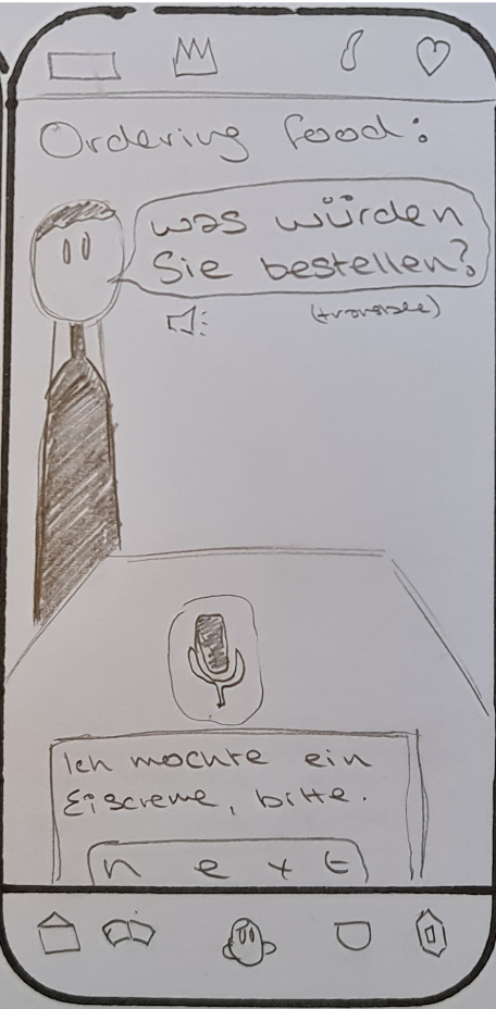
- Learn how to order ice cream in a restaurant.
- Connect to a native speaker to test your learning.

TEST RESULT 1
All Testers Got Excited About the New Features
So our concepts were well validated. However, there are some key insights we have to iterate for the next prototype.
SPEAKING PRACTICE
SPEECH BUBBLES
4 out of 5 were confused with the illustration of dialogue.
MICROPHONE AND ASSOCIATED BUTTONS
4 out of 5 were confused with the recording function and the associated buttons.
CONNECT TO NATIVE SPEAKERS
GLOBAL MENU
3 out of 5 couldn’t locate the feature under the profile menu right away.
CONTACT SCREEN
4 out of 5 wanted more information about the people on the list before sending a Friend Request.
3 out of 5 find the action Call appeared too abrupt before getting to know the person
OVERALL
GLOBAL MENU
5 out of 5 do not use three menus such as League, News Feed, and Shop in the global navigation at all.
4 out of 5 had different expectations on icons of the global navigation from the actual features. Especially returning users who haven’t used the app for a long time had a hard time remembering the meanings of the icons.
ITERATION 1
More Intuitive and Accessible Features
We created a mid-fidelity by iterating the following:
Intuitive Speaking Practice
DIALOGUE 1 -BEFORE
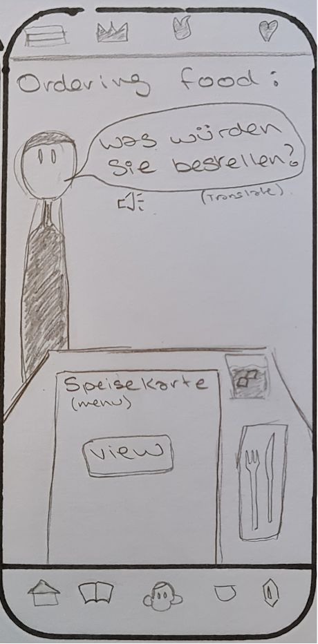
DIALOGUE 2 – BEFORE
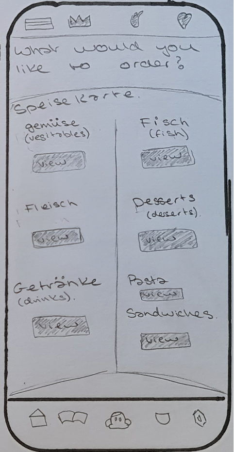
DIALOGUE 1 + 2 – AFTER
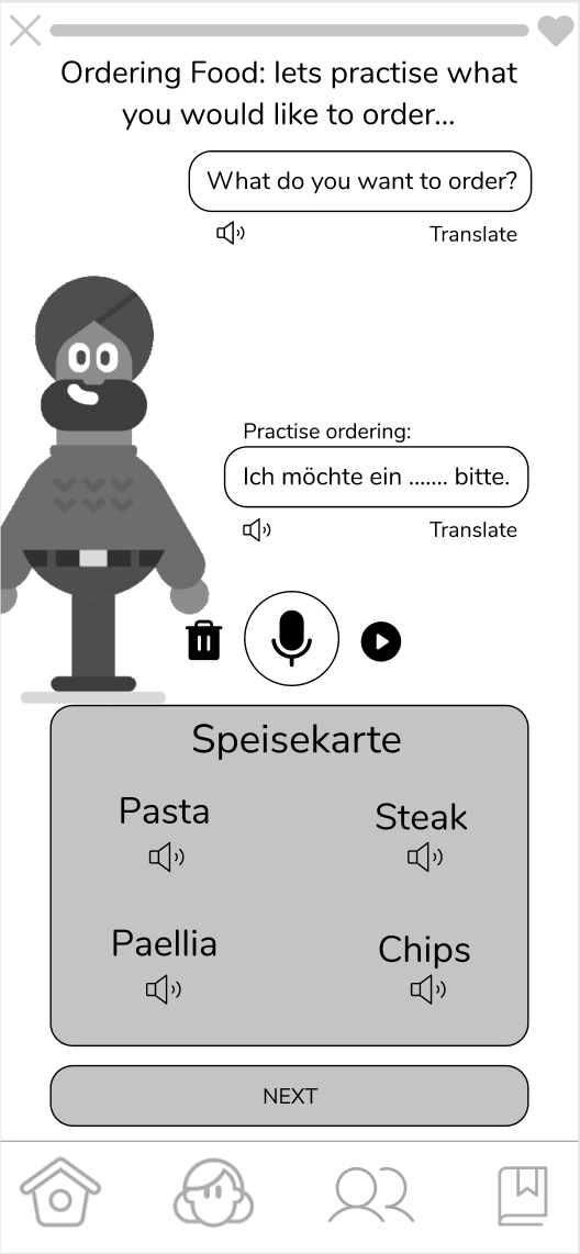
Changed the scenario to ordering a steak to make the dialogue more natural.
Unfolded the story faster to easily understand the flow.
Easy and Comfortable to Connect with Native Speakers
BEFORE
AFTER
List of Suggested Members
Added additional information the users wished to know.
BEFORE
AFTER
Contact
Removed call button.
Making New Features Accessible
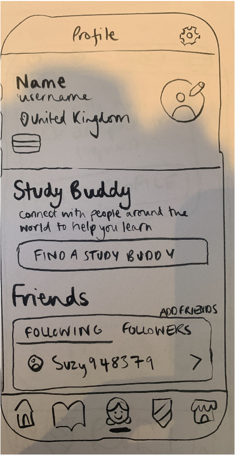
- Restructured the site map.
- Examined the current site map to find a better location of the features.
- Removed seldom-used menus from the global navigation.
- Replace them with Connect and Notebook features that users wished to have.
- Created local navigation of Learn and Practice.
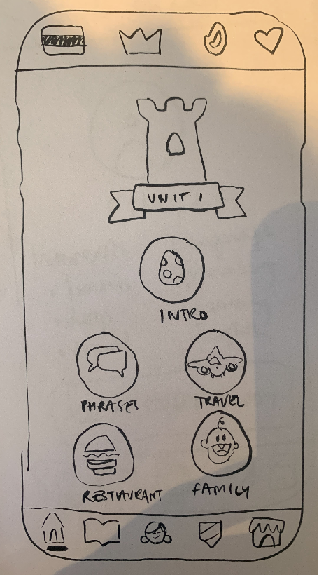
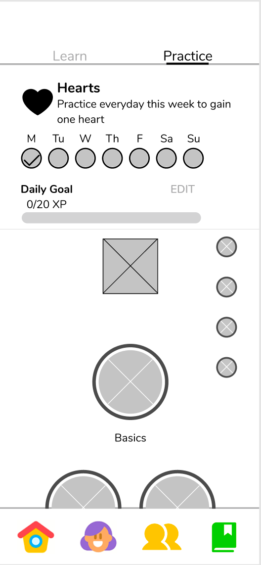
Current Site Map
The last three menus in the global navigation, Leadboard, News Feed, and Shop, are not often used by Testers.

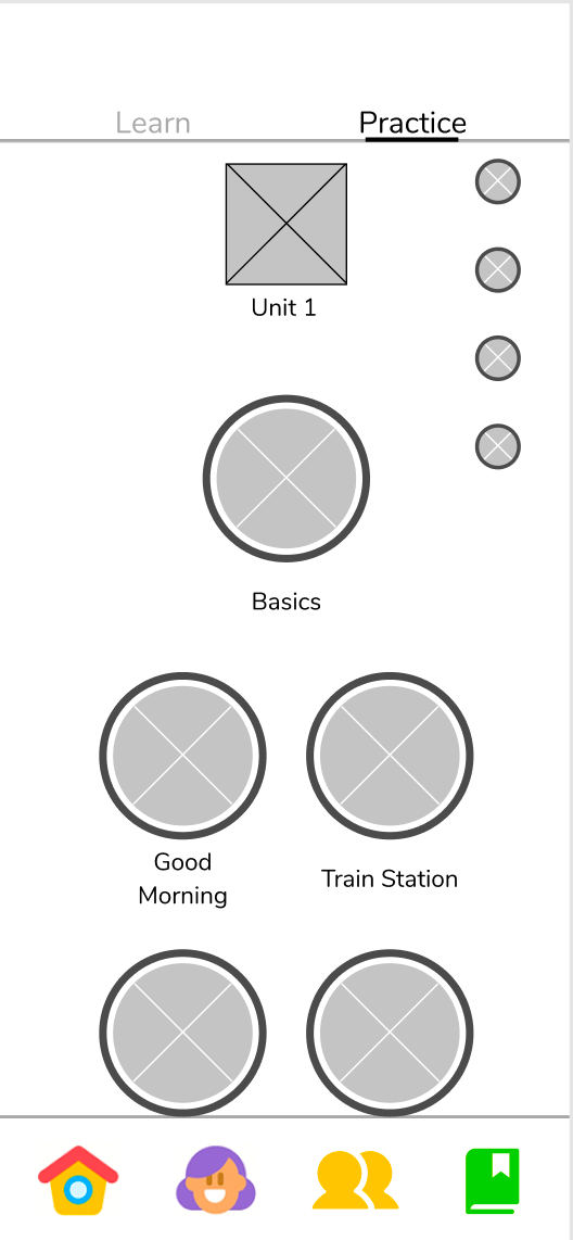
Iterated Site Map
New menus of Notebook and Connect were added in the global navigation. Seldom-used menus are relocated.

USABILITY TESTING 2
Letting Users to Choose from Our Design Variations with A/B Testing
We conducted the second usability testing on the iterated prototype with a total of five, both only Duolingo users and non-Duolingo users, to validate our iterated design. After the iteration, we ended up with two design variations for some screens. So we divided to try A/B Testing to see if we see any difference in the user experience. Although we learned later that A/B testing is usually conducted with a number of testers, we still saw a clear difference in usability.
TASK:
- Learn how to order a steak in German in a restaurant and find a Study Buddy to practice with.
- Connect to a native speaker to test your learning.
TEST RESULT 2
The Graphic was Still Confusing
SPEAKING PRACTICE
PRACTICE SCREEN
TEST SCREEN
EVALUATION SCREEN
5 out of 5 were confused with the use of the microphone.
4 out of 5 were confused with the flow of the lesson such as practice, test, and evaluations.
2 out of 2 pressed the Finish button instead of the Connect button although they knew they were supposed to look for a study buddy.
CONNECT TO NATIVE SPEAKERS
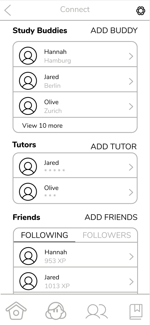
LIST OF SUGGESTED
LIST OF STUDY BUDDIES
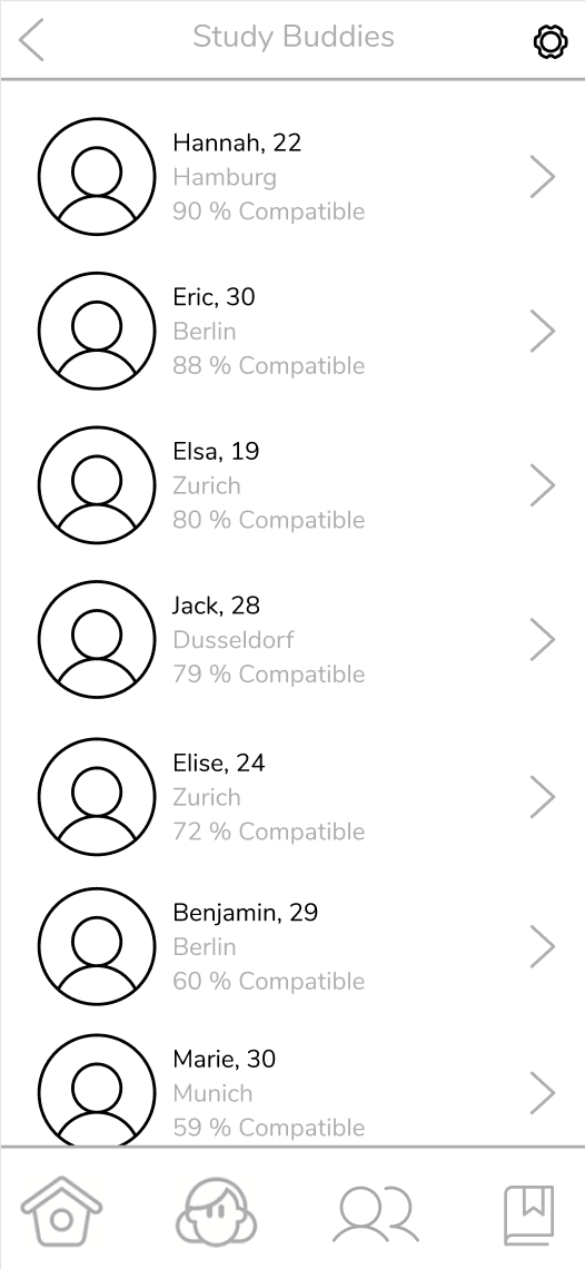
4 out of 5 pressed profile pictures instead of the Add Buddy button to proceed to add a study buddy.
2 out of 5 wished to have more relevant information about tutors.
2 out of 5 found the word ‘Compatibility’ slightly out of context.
A/B TESTING
VERSION A
VERSION B
In version A, the graphic of the streak was too dominant for users to see the local navigation above it.
VERSION A
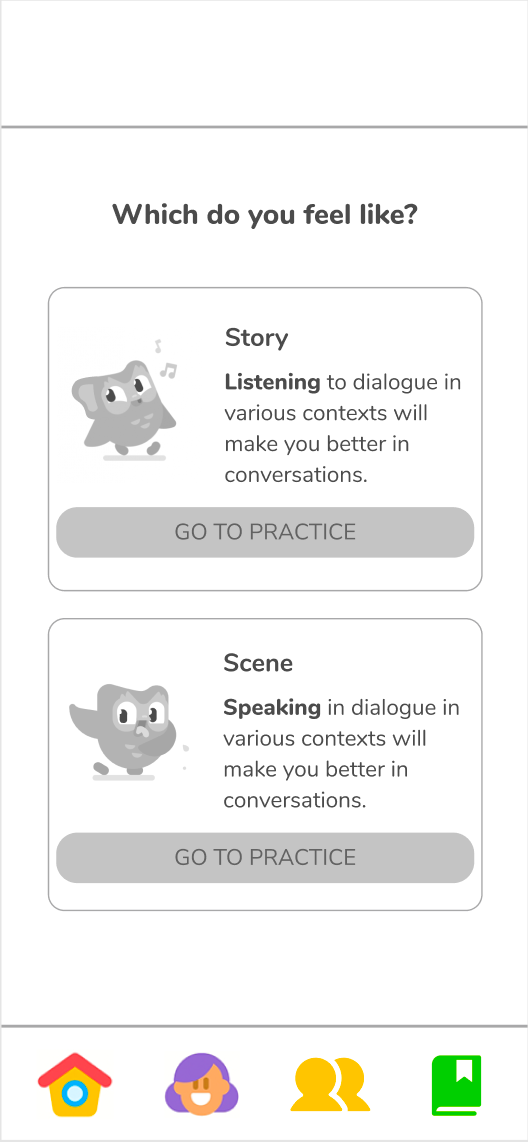
VERSION B
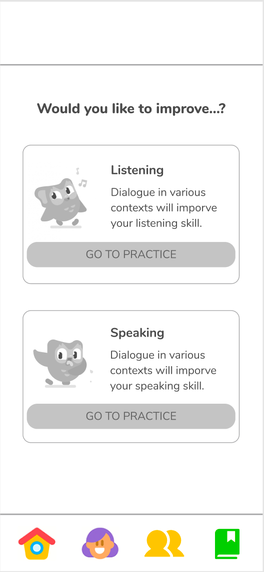
In version A, we tried to keep Duolingo’s tone of voice with the words ‘Story’ and ‘Scene’. However, users took more time on the page.
ITERATION 2
Restructuring IA to Make the New Features Easily Accessible
We created a mid-fidelity by iterating the following:
Smooth Flow of Speaking Practice
ONBOARDING
SUGGESTED SCREEN – BEFORE
SUGGESTED SCREEN – AFTER
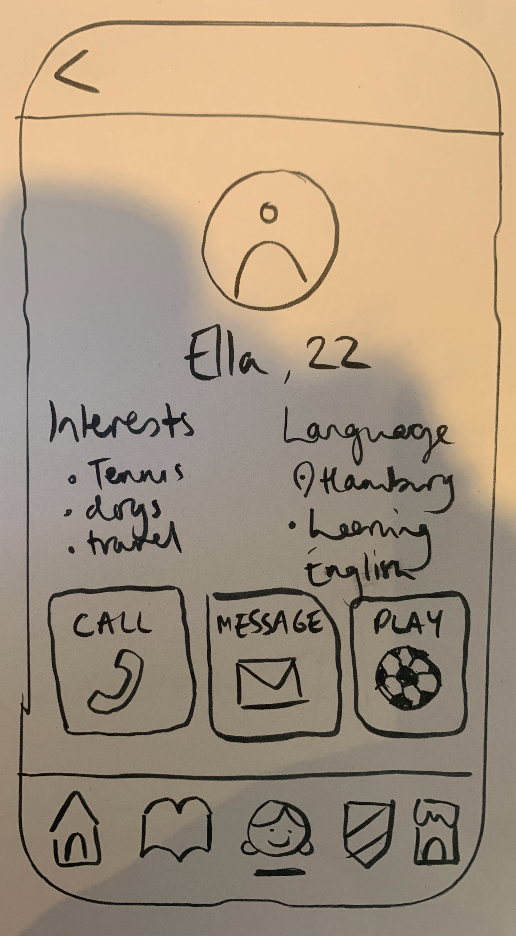
DETAIL PROFILE SCREEN – AFTER
Added the onboarding before starting the lesson to introduce the flow and the use of a microphone.
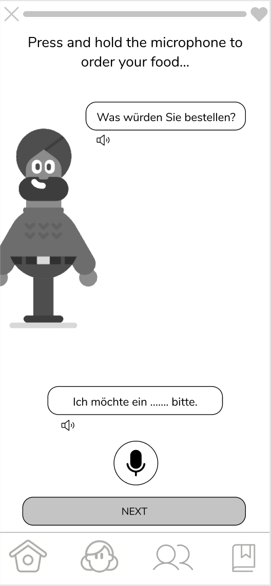
SPEAKING PRACTICE
DIALOGUE – BEFORE
DIALOGUE – AFTER
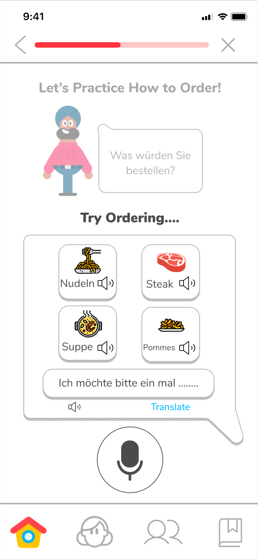
Simplified the microphone function just to check pronunciation.
Illustrations were added to the menu to visually grasp the manings.
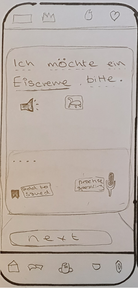
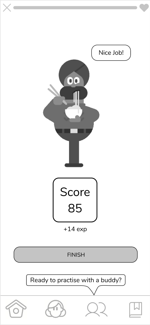
PRACTICE WITH BUDDY – BEFORE
PRACTICE WITH BUDDY – AFTER
Changed the Finish button to Change Scene and added the Practice with Buddy button next to it.
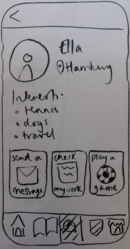
More Informative Profiles in the Connect Feature
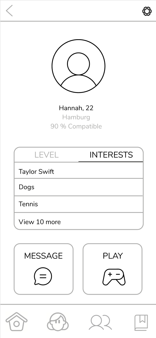
CONNECT TO NATIVE SPEAKERS
SUGGESTED SCREEN – BEFORE
SUGGESTED SCREEN – AFTER
DETAIL PROFILE SCREEN – AFTER
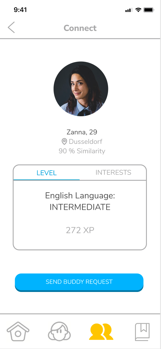
Removed the Add Buddy button and allowed the profile picture to lead to the detail profile page
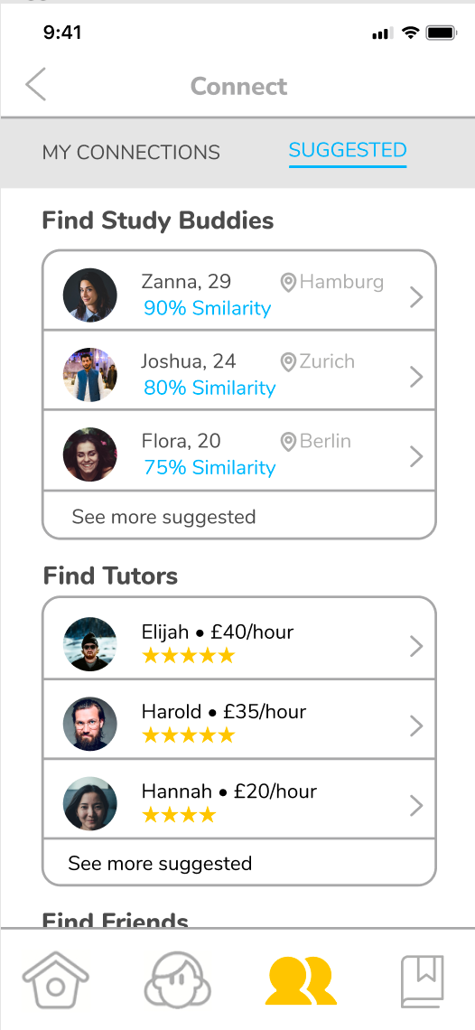
Added the information of rating and fee of tutors.
Changed the word ‘Compatibility’ to ‘Similarity’.
6
NEXT STEPS
Another usability testing on our final prototype.
To Add a feature to learn the cultural highlights.
7
KEY LEARNINGS
This first UX team project taught me the following important lessons:
Evaluation and prioritization of the collected data are important in UX research. When we synthesize our research, each team member brought her or his own insights. Evaluating the data to prioritize by quantizing helped us to build a solid design foundation.
Research results should be shared in a team in an easily readable manner. Because information is easily misunderstood in a fast-pacing working environment, critical insights can be missed. As a result, the design won’t fully reflect them.
Understanding the priority of user needs is crucial to evaluate features. Duolingo has many features to entertain users to keep on track of their learning path. However, they are underuse as users eventually lose interest in them because they don’t bring them toward their real goals.
Project management and the early establishment of ground rules such as systematic decision-making process and design system of UI elements are important in a team. This project allowed me to think further about how I can improve it on the next projects. With my background as an architect, I know more about waterfall projects. So this project made me want to explore more about project management methods in sprints.
8
AFTER THE STORM
This team project taught me important lessons about the UX design process in a team. There were some challenges but tackling them by exchanging ideas among team members was a lot of fun! I am ready to work with more inspiring people in the real world!