Run in the Company Anytime You Feel Like it!
People enjoy running in the company. But it is not so simple as it sounds. You have to find someone near you, get to know the person, and find a schedule that fits both – these pain points were revealed from user interviews. After extensive ideation to solve these problems, I came up with a creative solution to skip all at once.
Project Summary
OVERVIEW
Date: February 2021
Type: Conceptual Project
Duration: 2 Week
Team Size: 1
Setup: Remote
Device: Mobile
Scope: Application Concept Development
ROLE
I solely worked on research and schematic UI design to develop the running mobile application.
UX SKILL
- User Interviews
- Affinity Mapping
- Usability Testing
- Design Thinking
- User Flow
- Sketch
- Wireframes
- Mid-fi Prototypes
CHALLENGES
- My first UX project.
- First time using Figma.
RESULT
Deliverables:
- Research
- Personas
- User Flows
- Mid-fi Prototype
The application concept and schematic design made testers very excited!
KEY LEARNING
- User Interview is so important and so much fun discovering new insights.
- Psychological behavior changes in a group or to an individual even online.
- There are so many cool Figma plug-ins!
Final Prototype

Walk-Through
“It totally makes sense!”
“I would love to use this app!”
From a tester
The first encounter is not easy for most people, even in person. Especially in the digital world, it becomes even harder and the suspension in correspondence is killing them. In GroupXRsize changed the whole game by changing the user’s mindset to a-member-to-a-group communication from communication between two strangers. As a result, the reluctance and discomfort were greatly lessened and the process itself became much easier and shorter.
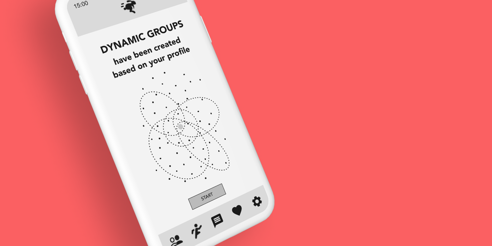
Key Design Impact
No More Advance Planning Needed
Not everyone is a good planner, especially when it comes to running. Sometimes you just spontaneously want to run with someone. GroupXRsize shows you a list of real-time matching runs around you. Now you can just join one of them without planning!
Easy Search for a Matching Run Based on Any Criteria
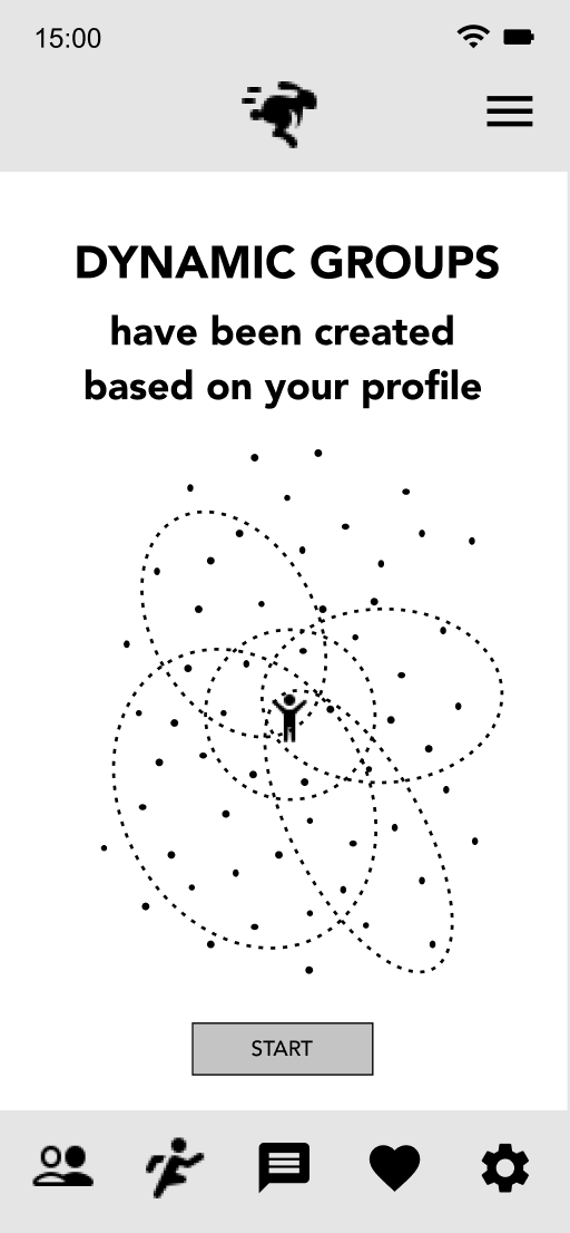
GroupXRsize matches you with different kinds of runs based on your profile data. Do you want an easy run near you, a fast run, or a long run? Don’t worry! It’s easy and quick to find any run you want.
No More Unnecessary Small Back-and-Forward Messages
Most people feel reluctant to initiate the initial contact to join an online group. GroupXRsize places you in matching dynamic groups once you sign up. So, you only need to find a matching run and press the Join button. Then it’s all set to enjoy the run in the company!
Behind the Scene
1
How It Started
For the first UX project in the UX Design Immersive of General Assembly, I was given a problem from a classmate, Dora. she shared with me a problem in her life. And I was to solve her problem by designing a mobile app. How exciting!
BACKGROUND
Since Dora’s athletic friend moved away, she now has no one to run with. She finds it very helpful to have someone along her side when she trains for a half marathon which she signed up for a while back. The current COVID situation makes it even harder as neither running clubs nor Meetups are active at the moment.
OBJECTIVES
To develop a mobile application to solve Dora’s problem:
- To easily find a running buddy near her to train for a half marathon.
- To avoid as many awkward moments as possible.
TARGET
Intermediate runners who enjoy running in the company like Dora
2
DISCOVER
Dora shared with me a problem in her life. Having understood Dora’s problem, I interviewed five intermediate runners.
USER INTERVIEW
Everyone Enjoys Running in Company Some Times, But…
After the total of six interviewees, I put all insights into the Affinity Map to distinguish their trends in the behavior, goals, motivations, pain points, and criteria for running buddies.

KEY INSIGHTS
- 5 out of 6 are interested in connecting to people for exercise.
- 5 out of 6 currently use apps to get related information and/or connect to people.
- 4 out of 5 who use applications hesitate to connect to others.
- 4 out of 6 find helpful:
- To have peer pressure.
- To have exercise partners.
3
DEFINE
PERSONA
Hesitate to Make the Initial Contact
From the user interviews, I developed a persona, Kate who represents all the trends I discovered. I was developing this app for her and whenever I wasn’t sure, I went to listened to her again.

Although there are applications like Strava to connect runners, people feel great hesitation to initiate contact. So they end up using such applications just to see posts from other members.
I wondered what exactly makes them hesitate. So I examined the process more closely.
PAIN POINTS IN THE PROCESS OF THE INITIAL CONTACT
- Finding individuals and groups of interests.
- Sending ‘Friend Request’.
- Wondering about contacting him/her/them.
- Thinking about what to write.
- Worrying about how your message will be perceived.
- Waiting for a reply.
KATE’S USER JOURNEY
Pain points during the initial contact

4
DESIGN
With the pain points in the process of making the initial contact, I started wondering if all of the effortful steps can be effortless.
So I came up with the following How Might We statements.
HOW MIGHT WE…?
- Make others find Kate instead?
- Make Kate feel more comfortable contacting others?
- Let Kate skip joining groups?
- Connect Kate to others more conveniently based on her various demand?
IDEATION
Skip the Process of the Initial Contact to Individuals/Groups
I thought that the an-individual-to-an-individual approach is intimidating when users don’t know each other yet. So I shifted my focus to ‘finding a run’ from ‘finding a running buddy.
I also thought that sending a friend request or asking permission to join a group unwillingly puts a vulnerable position, which makes some users hesitate to make the initial contact.
So, my design concept came to my mind.
DESIGN CONCEPT
- Assigned Groups: Users belong to different categories of groups based on their profile and running performance once they sign up.
- Match-Making: Users no longer need to actively look for groups or individuals, no more friend requests or following, and absolutely no step to see relevant posts based on your profile.
- Adjustability: Users can also adjust the group setting or remove themselves from assigned groups if they wish.
- Search for runs instead of running buddies: the relationship among users is no longer an individual to an individual. Instead, it became a group member to a group-based run.
USER FLOW
Easier and Shorter Flow by Skipping the Contact Process
From the design concept, I created a new user flow to find a run. Compared to the one to find a running buddy, it is so clear that the number of decision-making points and actions was reduced and the flow itself became much simpler and shorter.
The following flow diagrams visually demonstrate the big improvement.
USER FLOW OF FINDING RUNNING BUDDIES
The flow of searching for a running buddy takes many decision-making points, especially in the contact phase.

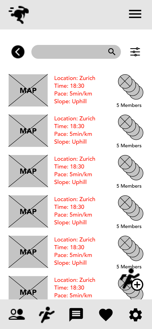
USER FLOW OF FINDING RUNS
By skipping the process of contact, the flow has fewer decision-making points and became simpler.

INFORMATION HIERARCHY
All Depends on What Types of a Run One Feels Like Today
After the flow, I organized information of criteria for a run I collected from the user interviews to understand the information hierarchy.
THE INFORMATION TO SEARCH FOR A RUN
Runners need different information depending on the purpose of a run. Generally, the logistics and the athletic level are more important than the personal information.

5
ITERATE
With the all conceptual ideas in my head, I started sketching. Once I got more concrete ideas, I moved to develop the low-fi prototype.
SKETCH
I sketched some screens to create the conceptual flow.

USABILITY TESTING 1
Does finding a run make sense?
With the prototype, I conducted usability testing with three testers.
TASK:
Find a run with 5min/km to join after work nearby the office.
TEST RESULT
All Testers Looked for a Running Buddy Instead
Even though I clearly asked them to find a run, they looked for a running buddy and got confused with the screens with no information about the runners. Eventually, they understood the information was sorted for runs. Once they understood the concept fully, they liked the idea. After all, usability had lots to work on.
ITERATION
Setting the Conceptual Model & the Clear Information at Right Time
I will show you the rest of the results and their iterations side by side below:
ONBOARDING SCREEN
BEFORE
Until the list of runs, 2 out of 3 had thought they were looking for other members because the application they currently use is set in the way. So they were confused with no member information.
AFTER
Adding the onboarding at the beginning to educate users about the app.
RUN CATEGORY SCREEN
BEFORE
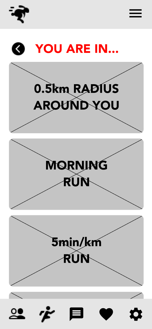
2 out of 3 were not sure about the run categories because of the screen title You Are In…
AFTER
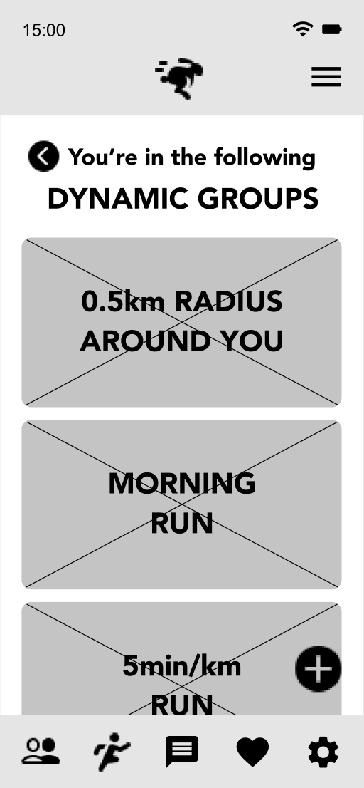
More clear wording for better navigation.
LIST OF RUNS SCREEN
BEFORE
2 out of 3 thought there was too much information on the list of runs and some information was irrelevant for the selected groups.
AFTER
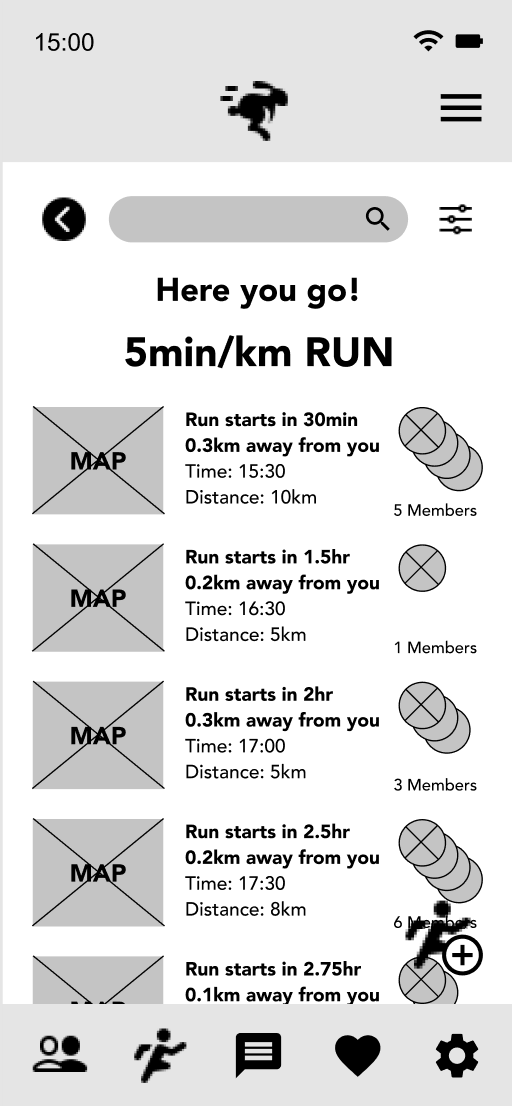
Coherent wording for better feedback in the transition of pages.
Types, hierarchy, and wording of information for user-centered design.
RUN DETAIL SCREEN
BEFORE
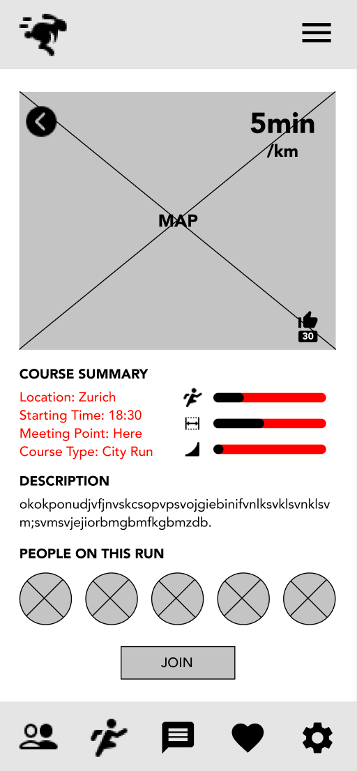
2 out of 3 thought that some information was repetitive for the selected groups and the icons were unclear.
2 out of 3 wanted to check member profiles or to contact members before joining a run.
AFTER
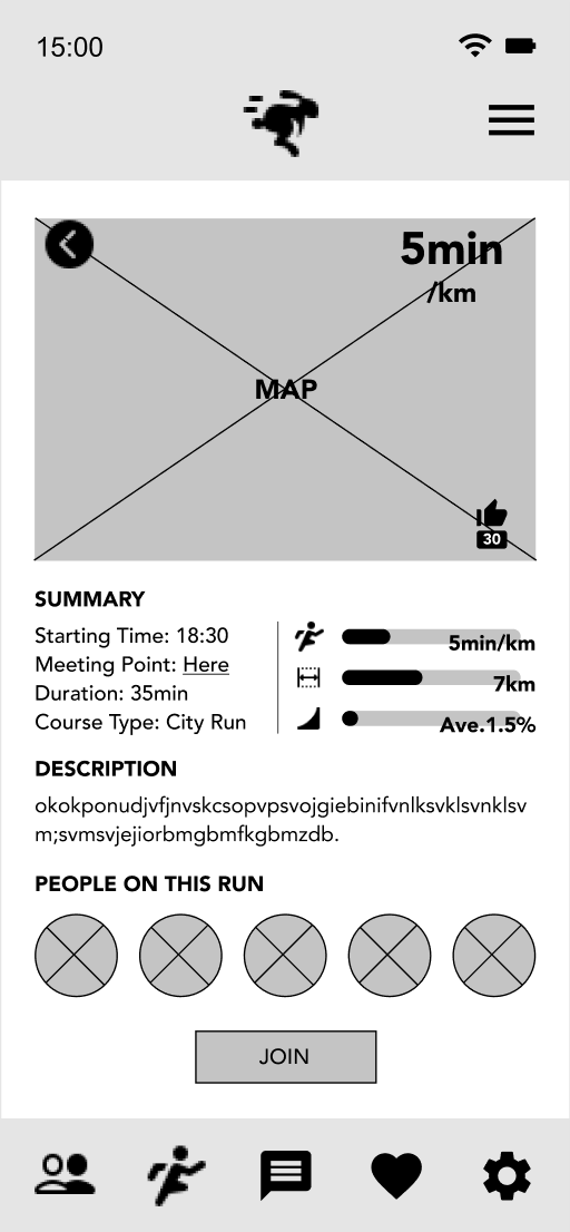
The repetitive information was removed.
The icons were accompanied by concrete data with units.
Profile pictures lead users to more detailed information and allow them to contact them.
6
NEXT STEPS
Branding and UI system.
Hi-fi Prototype followed by usability testing
7
KEY LEARNINGS
This first UX project taught me the following important lessons:
User Interview is so important and so much fun discovering new insights. I discovered something new at every interview. Something was so different from my personal experience and others similar to it. After all, I see there are so many different ways from my way.
The user interviews showed me the trends of users of running apps. I clearly saw that psychological behavior changes in a group or to an individual even online. Until then, I thought I was the only shy person who is reluctant to initiate the first contacts on social media. But most people feel the same way! What an interesting discovery!
There are so many cool Figma plug-ins! It was the first time for me to use Figma. I quickly fell in love with it, especially the plug-ins and templates from the community. Yes, sharing is caring! Big thanks to the community♥ I’m so excited to explore more!!